
 Bitcoin ($BTCUSD) is riding a wave of surging optimism, smashing past $112k as retail and institutional capital pour into the cryptocurrency. Some say the market has grown euphoric, and that a sharp pullback may be lurking around the corner. Others believe this is just the beginning of another leg higher.
A few key questions to guide your analysis: What does $BTCUSD’s history tell us about breakouts above major resistance after a prolonged period of sideways movement? If it’s the start of another move higher, how can you project an upside target? And, if it reverses, where could support levels come into play?
What $BTCUSD’s History Reveals About Breakouts and Big Rallies
Let’s begin by taking a look at a 3-year weekly chart.
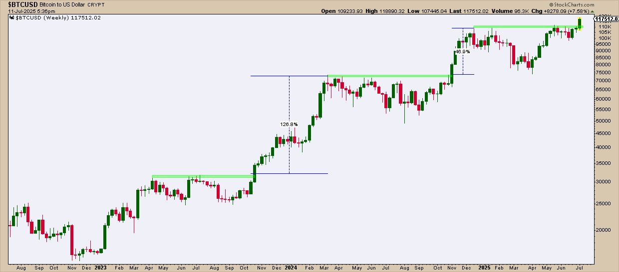
FIGURE 1. WEEKLY CHART OF $BTCUSD. Note the crypto’s impressive rallies after clearing resistance following a prolonged period of sideways trading.
In 2023, $BTCUSD traded sideways for six months, repeatedly failing to break above resistance around $31k. But once it did, the crypto soared more than 126% before a major pullback.
A similar pattern unfolded in 2024: seven months in a wide range, unable to clear resistance between $71k and $73k. When $BTCUSD finally broke out in November, it staged a parabolic move, rallying nearly 47% before pulling back again, setting another key resistance zone that brings it to overhead resistance range between $110k–$112k.
So this answers the question posed about $BTCUSD’s historical tendencies after breaking above a prolonged range. Historically, the crypto tends to stage an outsized run once it clears critical resistance. But will it happen this time around? If so, how can you estimate a potential upside target? And if the breakout fails, where might $BTCUSD find support?
Seasonality Trends: $BTCUSD’s Strongest Months
Before looking at a daily chart, let’s look at $BTCUSD’s seasonality chart going back 10 years. If you’re curious as to how the crypto has performed during the summer months, maybe this can help.
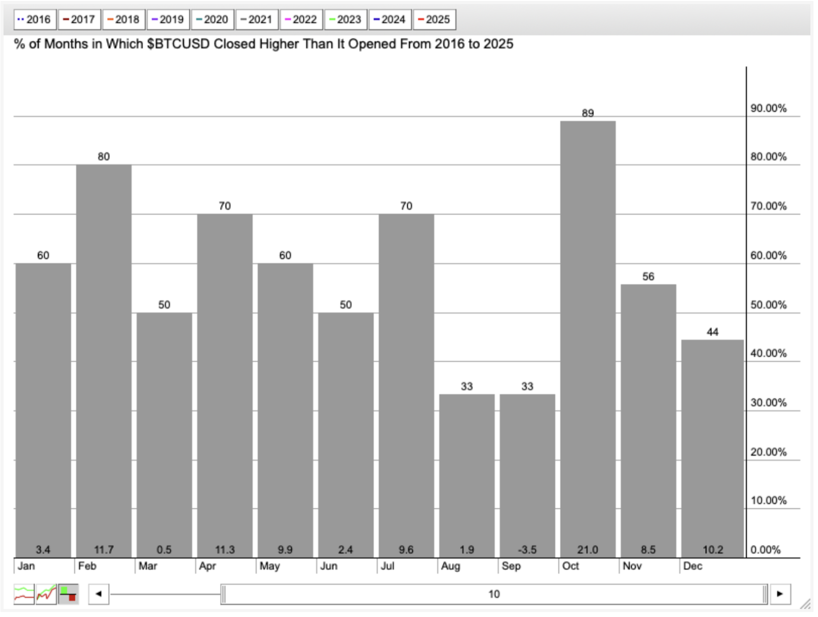
FIGURE 2. 10-YEAR SEASONALITY CHART OF $BTCUSD. Most months on average have been quite strong for the asset, but October’s performance has been strong, with an average seasonal return of 21%.
According to its seasonality performance, July is arguably strong with a favorable positive close rate (70%) and return (9.6%). However, October is the crypto’s strongest month, with an 89% positive close rate and an average return of 21%. Over the last 10 years, $BTCUSD’s performance has been volatile, which accounts for the outsize returns on this chart. While seasonal tendencies don’t guarantee a repeat, knowing the general bullish/bearish seasonality context can help inform your analysis and trading decisions.
Now, let’s look at a daily chart to find entry points or estimate an upside target while identifying support, should its breakout fail to follow through.
$BTCUSD Breaks Critical $112K Resistance
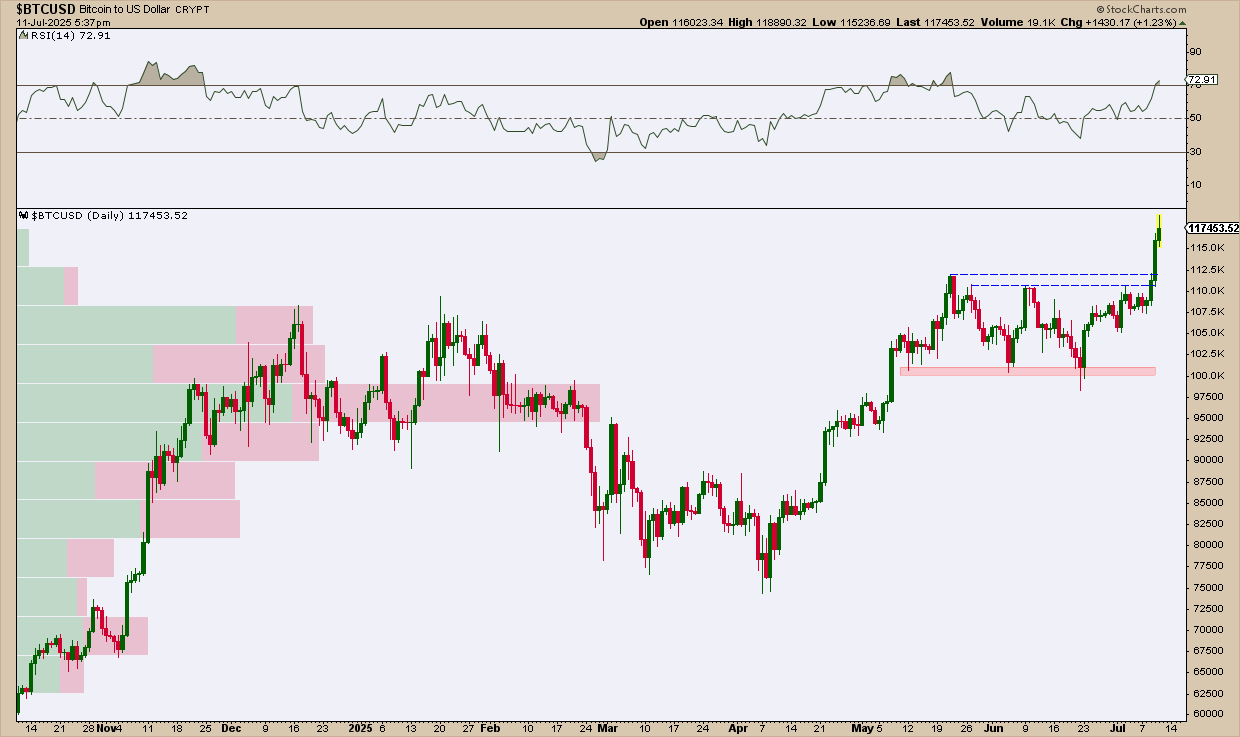
FIGURE 3. DAILY CHART OF $BTCUSD. The asset just broke above critical resistance. If you have a position, now’s the time to estimate potential price targets.
$BTCUSD just broke the critical resistance level of $112k. The Relative Strength Index (RSI) is indicating strong momentum, easing into an overbought reading. While there’s no way to fundamentally determine the crypto’s upside target, one technical method is to use a measured move by taking the height of the prior range and adding it to the top of the range (or the breakout level; this varies by trader).
Calculating an Upside Target Using a Measured Move Approach
Measuring the range from the support area around $98k up to $110–112k (we’ll settle for $110k), you can project that distance of $12k above the top level of the breakout range, which implies a potential target near $124k, more or less.
$110k breakout + $12k range height = $122k–$124k target, depending on entry.
However, note that some traders don’t wait for a 100% measured move before taking profits. Some will exit positions as soon as a 60% move has occurred, but that really depends on the trader.
Key Support Levels to Watch if the Breakout Fails
Now, if $BTCUSD fails to follow through and reverses, you can reasonably expect support at roughly these three levels:
- The breakout level near $112k.
- A strong historical support level at around $110k.
- Another support level within the previous trading range (shaded red) near $100k, which coincides with concentrated levels of trading activity, according to the Volume-by-Price (the horizontal volume bars on the left side of the chart).
If $BTCUSD falls below the previous trading range, that is, below $98k, then the current rally is likely over.
What to Do Now
Ideally, a trader’s entry point would have been at $112k. Considering that some platforms allow fractional lots of $BTCUSD, some people may choose to enter smaller positions, as a fractional position would minimize risk and reward.
If you already have a position in $BTCUSD, put it in your ChartLists, and set a price alert at $124k or any measured move percentage below that 100% target level (like 60% of the measured move would be at $119k).
If the breakout fails, expect a near-term bounce between $110k and $112k. However, a move lower toward $100k or $98k would likely signal an end to the bullish thesis. Traders might even consider placing a stop a few points below $98k to avoid the likelihood of further downside.
At the Close
$BTCUSD has a history of explosive moves after clearing major resistance, but it can just as easily blindside you with a sudden reversal. That’s why it’s crucial to keep upside and downside levels in mind. Seasonality also favors the bulls, with most months delivering favorable returns. Add the crypto to your ChartLists and set price alerts to track whether your upside target is hit, or whether downside levels signal either an early bounce or a failed rally.

Disclaimer: This blog is for educational purposes only and should not be construed as financial advice. The ideas and strategies should never be used without first assessing your own personal and financial situation, or without consulting a financial professional.

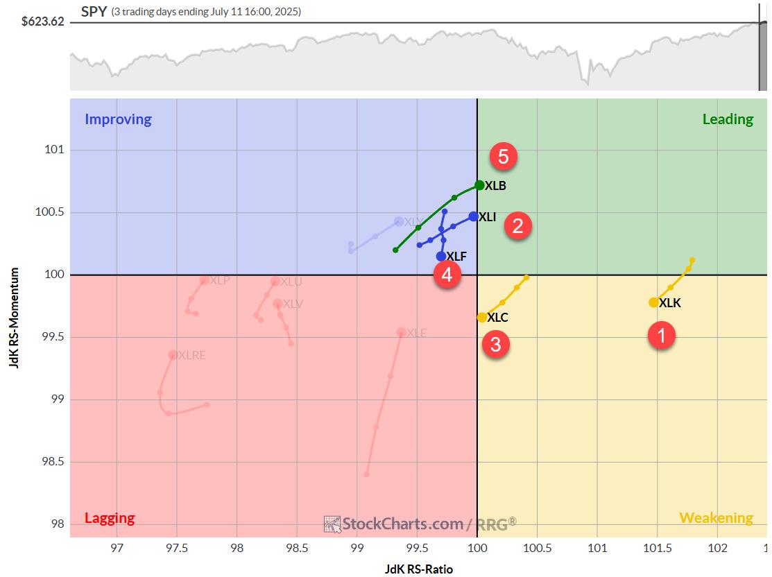
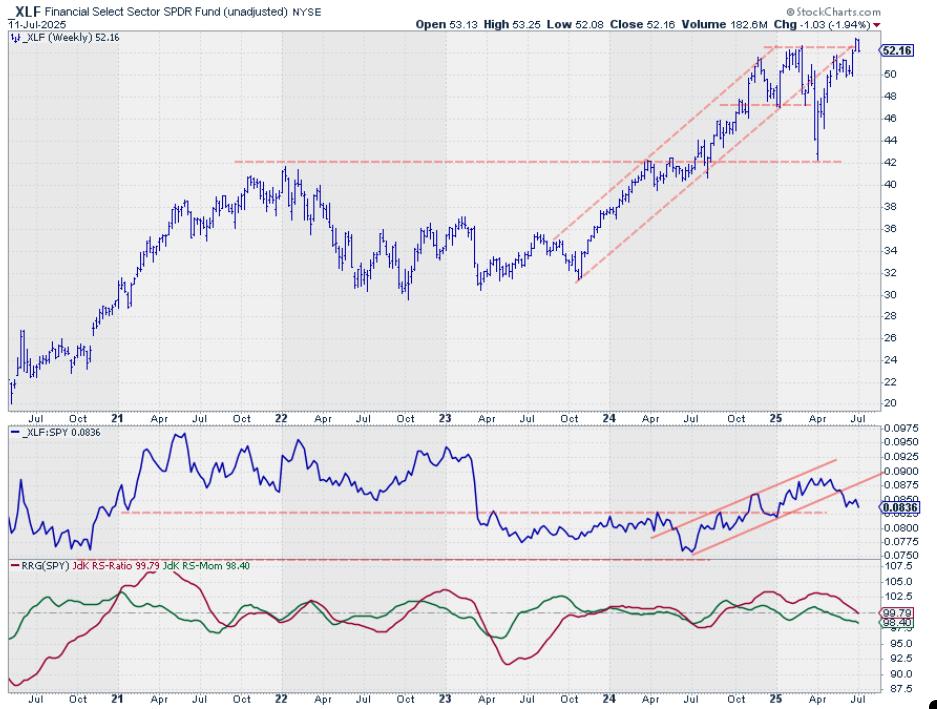


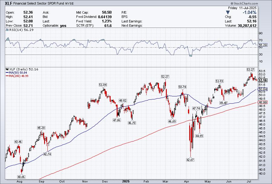
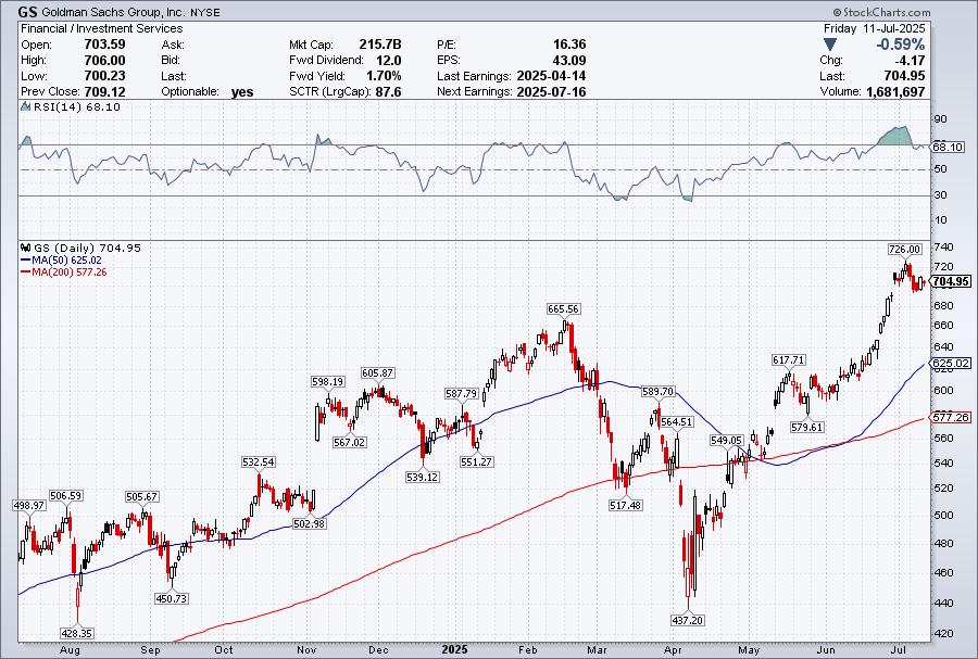
 As we navigate the evolving stock market landscape, understanding key sectors and their trends is important, especially during earnings season. This week, the spotlight shines on the Financial sector, with several of the largest banks reporting. Five of the top 10 holdings within the Financial Select Sector SPDR ETF (XLF) are on deck: J.P. Morgan (JPM), Goldman Sachs (GS), Bank of America (BAC), Wells Fargo (WFC), and Morgan Stanley (MS).