For those who focus on sector rotation, whether to adjust portfolio weightings or invest directly in sector indexes, you’re probably wondering: Amid the current “risk-on” sentiment, even with ongoing economic and geopolitical uncertainties, can seasonality help you better anticipate shifts in sector performance?
Current Sector Performance Relative to SPY
To find out, let’s first look at how sectors are performing relative to the SPDR S&P 500 ETF (SPY), our S&P 500 proxy. The StockCharts Market Summary Mini Charts tab in the US Sectors panel shows you sector ETF performance and its relative performance against SPY.
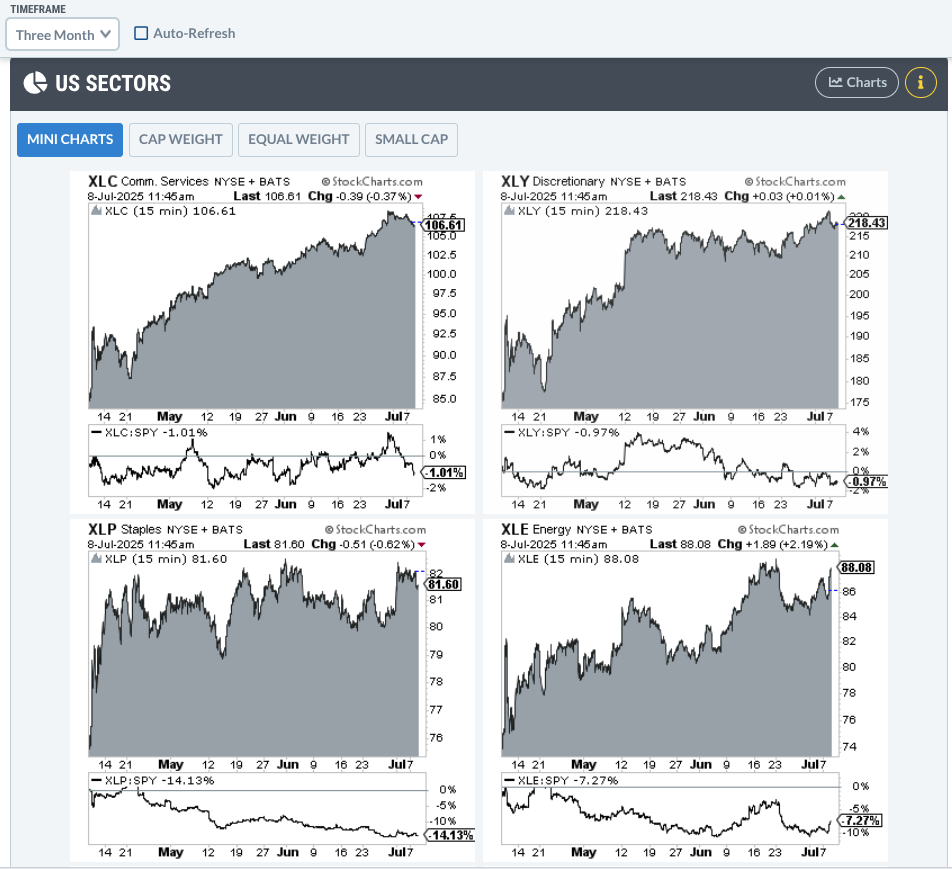
FIGURE 1. MARKET SUMMARY US SECTORS PANEL. The new micro charts feature provides a chart of each sector’s ETF plus its relative performance against SPY, allowing you to gauge a sector’s strength against the broader market.
Looking at each sector chart over a three-month time frame, only two sectors are outperforming relative to SPY:
- Technology Select Sector SPDR Fund (XLK): Currently outperforming SPY by 13.85%.
- Industrial Select Sector SPDR Fund (XLI): Outpacing SPY by a modest 2.53%.
Spotlight on Technology and Industrials: Leading Sectors in a Risk-On Market
As a side note, Technology and Industrials are two sectors that align with the risk-on narrative. This suggests that the market is currently favoring higher-beta stocks (as XLK’s performance reflects) over safer sectors and that demand for industrial goods is generally rising, a sign investors expect the economy to strengthen.
Understanding Sector Seasonality: What History Tells Us
Now, let’s turn to seasonality. In this context, seasonality refers to the tendency for certain sectors to perform better during specific periods and worse during others. While past performance never guarantees future results, it can help you anticipate how a sector might behave based on historical tendencies, not certainties.
So, what might the seasonality charts suggest about XLK and XLI in the coming months?.
XLK Seasonality Trends: Tech Sector’s Strongest Months
Take a look at XLK’s 10-year seasonality chart.
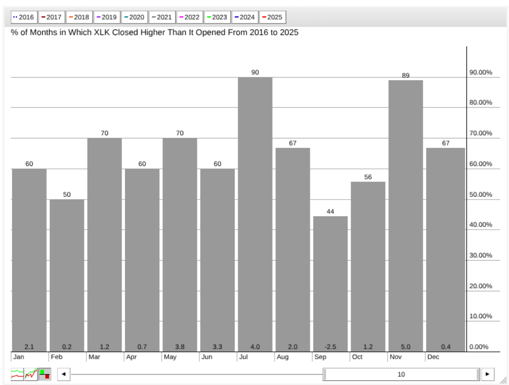
FIGURE 2. 10-YEAR SEASONALITY CHART OF XLK. While September appears to be tech’s only bearish month from a seasonality perspective, its strongest months are November and July.
Over 10 years, July has been XLK’s second strongest month, with positive closes 90% of the time and an average monthly return of 4%. The most profitable month is November, with an 89% positive close rate and a 5% average monthly return. August isn’t bad, but July is exceptionally strong and reflects its current overall performance.
XLI Seasonality Patterns: When Industrials Tend to Outperform
Switching over to a seasonality chart of XLI, we get a similar picture.
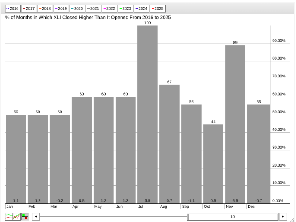
FIGURE 3. 10-YEAR SEASONALITY CHART OF XLI. July is XLI’s strongest month for positive closes, and November is its strongest month for average seasonal returns.
This pattern is pretty exceptional: over the last 10 years, XLI has posted a historical 100% positive close rate in July, with an average return of 3.5%. The strongest returns, however, tend to occur in November, which shows an 89% positive close rate and an average return of 6.5%. The months in between are relatively unremarkable, making July and November stand out significantly.
Technical Analysis of XLK and XLI
Will July be another up-month for XLK and XLI? Starting with XLK, let’s switch over to a six-month daily chart.
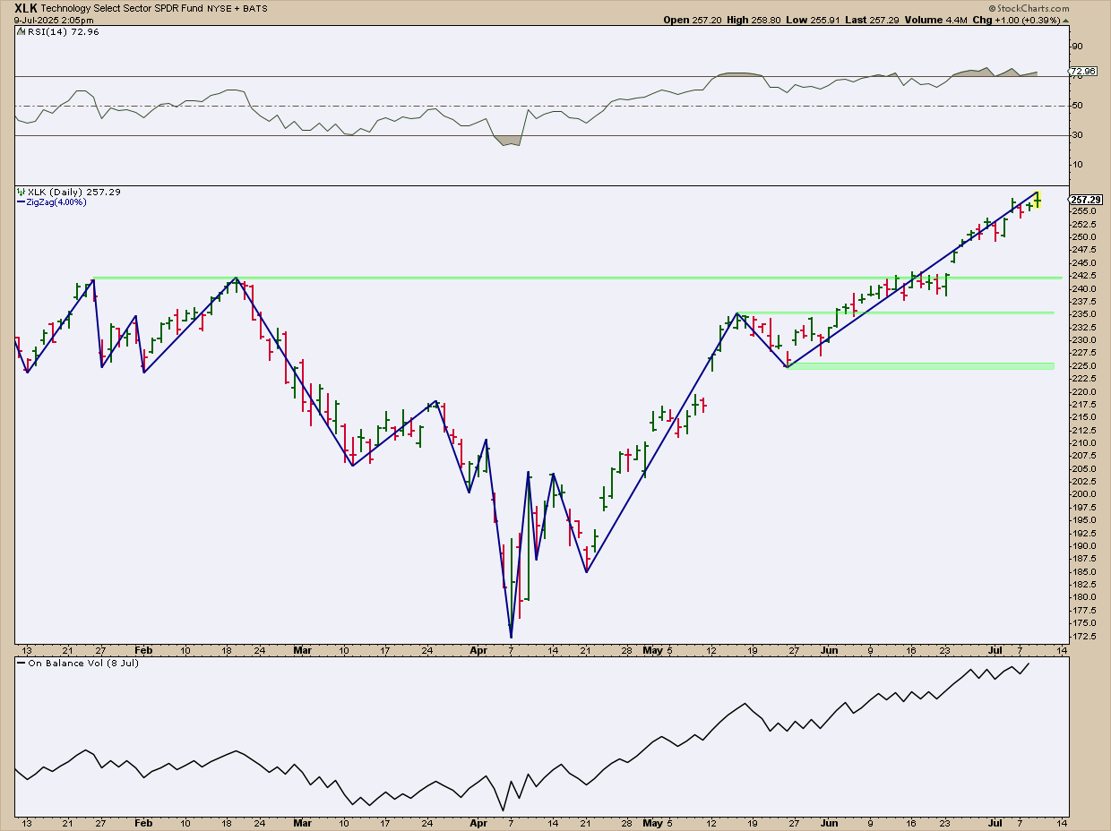
FIGURE 4. DAILY CHART OF XLK. Tech’s upward trajectory is now in overbought territory, yet there’s little sign of slowing.
XLK is at an all-time high, and there’s no clear indication that it’s pulling back just yet.
Meanwhile, the Relative Strength Index (RSI) is suggesting that XLK has been occupying overbought territory since late June. However, bear in mind that an RSI reading at this level can sustain itself for an extended period. And if you look at the On Balance Volume (OBV) indicator, it suggests that the buying pressure trend is still rising with no signs of slowing down.
Actionable Tip: Remember, July is one of XLK’s historically strong seasonal months.
- But if it does pull back soon, you might expect a bounce near $242.50, which is an area marked by a series of historical swing highs.
- Notice how the ZigZag line highlights these key swing points.
- Other areas of support sit around $235, its most recent swing low, and $225, the level of its most recent swing low.
Now let’s turn to the daily chart of XLI.
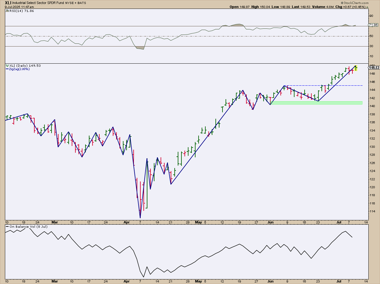
FIGURE 5. DAILY CHART OF XLI. Industrials are also surging, although buying pressure may be starting to decline.
Similar to the previous chart, XLI shows a move higher that places it well into all-time high territory. July is also an exceptionally strong month for XLI, but does it have enough fuel to return the seasonal 3.5% that it typically averages this month?
The RSI signals that XLI may be overbought, which, again, can remain there for some time, while the OBV suggests that buying pressure may be easing into a pullback. However, price continues its upward trajectory.
Actionable Tip: If XLI dips, the pullback may be shallow, potentially bouncing near $145, its most recent swing high. A more substantial support level lies around $141, where multiple swing lows have formed. If XLI drops below $141, you can expect further downside movement.
At the Close
While no strategy can guarantee success, combining seasonality insights with price action can help improve your market timing. Keep an eye on support levels as well as momentum and volume. Remember that the strongest months for XLK and XLI tend to be July (the current month) and November. You can add XLK and XLI to your ChartLists and keep an eye on them, especially in the months ahead.
However, the big takeaway here is to consider using seasonality charts alongside the various tools in the Market Summary, whether you’re considering an individual stock, index (sector or industry), or other asset classes, like commodities and monetary metals. While price action can help you nail down specific market opportunities, seasonality charts can help contextualize current price action and anticipate potential future market scenarios.

Disclaimer: This blog is for educational purposes only and should not be construed as financial advice. The ideas and strategies should never be used without first assessing your own personal and financial situation, or without consulting a financial professional.


 A good trade starts with a well-timed entry and a confident exit. But that’s easier said than done.

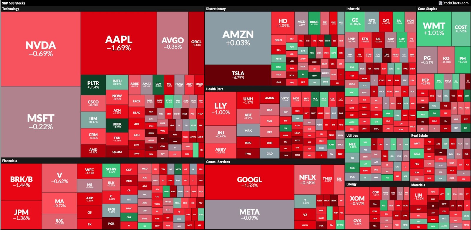
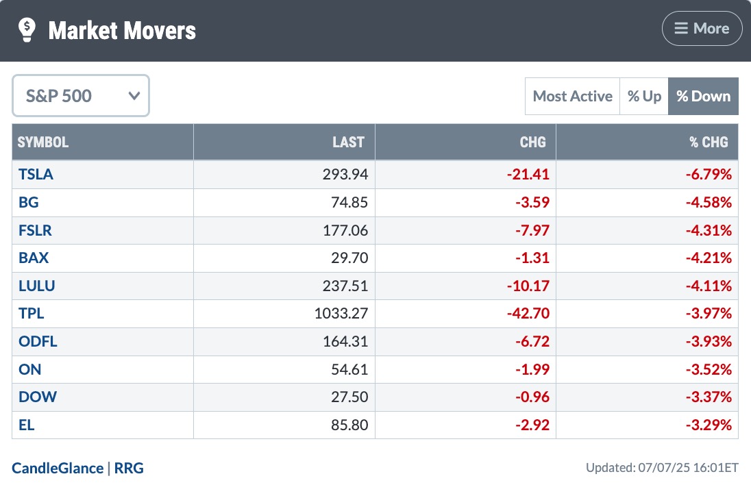
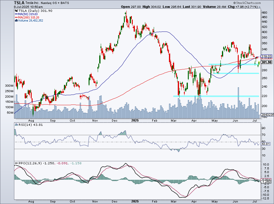
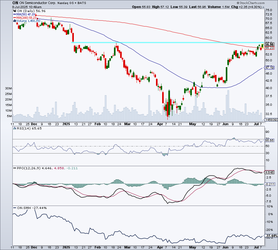
 After months of whiplash sector swings, the market may finally be showing signs of settling down.
 When sector performance shifts gears from one day to the next, it’s best to be prepared with a handful of stocks from the each of the sectors.