
 As the cycle of uncertainty continues to yield confusion than clarity, investors are again caught having to decide between taking an offensive and defensive posture in the market. The tough part in today’s market environment is how fast situations can shift. With headlines driving the action, sentiment can flip on a dime. So how do you position yourself when breaking news drives the market?
No one can predict how the stock market will play out in the coming months. But keeping an eye on the ratio of “offense” to “defense” stocks can offer some clues. This may not give you a decisive trade scenario, but it can provide a clearer context that can help you form a more bullish or bearish decisive bias.
For this article, let’s refer to the StockCharts Market Summary tool and zoom in on the Technology vs. Utilities ratio (XLK:XLU), which you can find in the Key Ratios – Offense vs Defense panel.
Why XLK:XLU Ratio Matters
This ratio compares the Technology Select Sector SPDR Fund (XLK) with the Utilities Select Sector SPDR Fund (XLU), both being sector proxies (see the one-year ratio chart below).
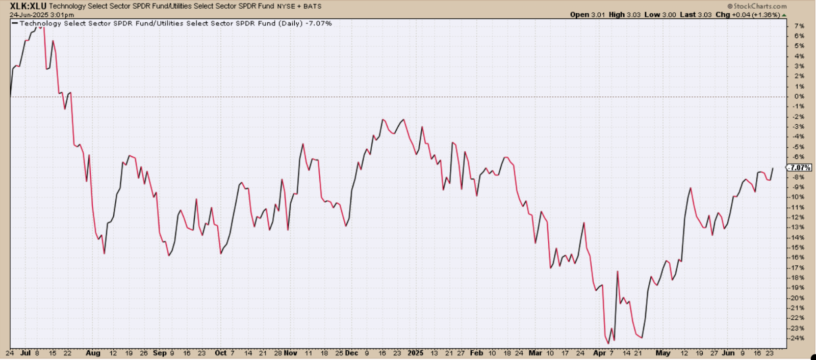
FIGURE 1. TECH VS UTILITIES RATIO: From a one-year perspective, utilities have outperformed tech.
The key question is whether capital will continue chasing innovation and growth or seek shelter in the relative stability of power grids and water systems. The answer, when it eventually comes, could signal the economy’s next move.
On the one-year chart, the XLK:XLU ratio shows an attempted recovery from a general decline. Note how the ratio percentage is negative. That’s because, over the past year, utilities have generally performed stronger than tech. But we’re seeing tech’s performance strengthening, and a sustained move toward (and eventually into) positive territory would suggest a stronger shift in bullish sentiment.
Notably, XLK and XLU are trading at their respective highs, with XLK already breaking above it. The question remains which sector may be topping or outpacing the other in a more sustained manner.
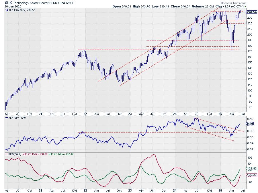
XLK Breaks Higher: A Bullish Signal?
Here’s a daily chart of XLK.
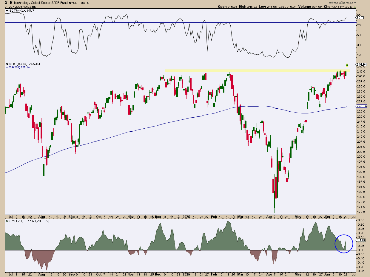
FIGURE 2. DAILY CHART OF XLK. A proxy for the tech sector, XLK has broken above resistance. The key question now is whether it can hold above this level and follow through, or if it’s topping out amid the current geopolitical uncertainties.
XLK’s surge from its April bottom, including the gap above $243, signals bullish momentum. It’s also trading above the 200-day simple moving average (SMA) while its StockCharts Technical Rank (SCTR) score has climbed above 76, signaling technical strength. Volume-wise, the Chaikin Money Flow (CMF) shows renewed strength in buying pressure, though CMF levels are down considerably since their highest levels in May.
XLU’s Rally: Strong, But Losing Steam
Compare XLK’s chart to XLU’s daily chart.
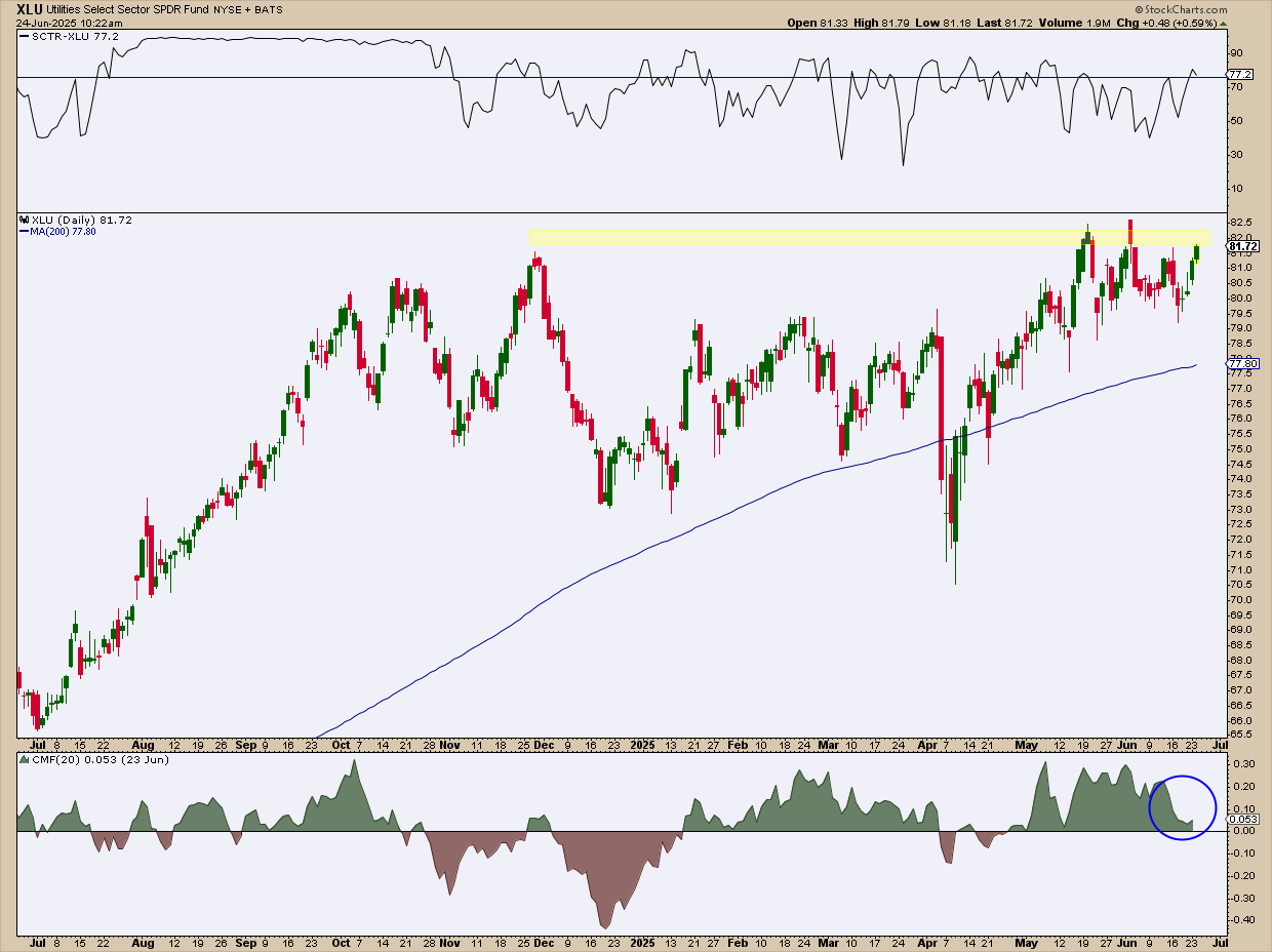
FIGURE 3. DAILY CHART OF XLU. The Utilities sector is challenging its highs, but is XLU losing steam, and will XLK eventually outpace it?
XLU is attempting to challenge its highs near the $82.50 range, though it hasn’t penetrated the top. Its SCTR score is also bullish at 77, though it’s not as convincing as that of XLK. XLU’s CMF reading also shows weakened buying pressure, as its levels are barely hovering above the zero line.
What These Charts Are Saying

Taken together, these charts aren’t about calling the next big trade. They’re about reading near-term sentiment and getting a feel for where investors think the economy is headed amid this tense geopolitical backdrop.
When both offense and defense are rising, it suggests uncertainty, with capital flowing in both directions. But when one sector pulls ahead, it may signal where institutional money is placing its bets. Whether you’re a short-term trader or long-term investor, tracking this ratio can help anchor your outlook, especially as global events continue to fuel market volatility.
Keep XLK and XLU on your ChartLists and continue to monitor this ratio, along with other comparative tools on the Market Summary page. Also, pay close attention to news developments.
At the Close
The XLK:XLU ratio might not give you the most comprehensive or surefire signal about investor sentiment, but it’s an important piece of the puzzle. It can help you see the bigger picture, which is a crucial step before placing any trades.
Disclaimer: This blog is for educational purposes only and should not be construed as financial advice. The ideas and strategies should never be used without first assessing your own personal and financial situation, or without consulting a financial professional.

 In this video

 This week, we’re keeping an eye on three major stocks that are reporting earnings. Two of them have been beaten down and are looking to turn things around, while the third has had a tremendous run and is looking to keep its extraordinary momentum going. Let’s take a closer look at each one.


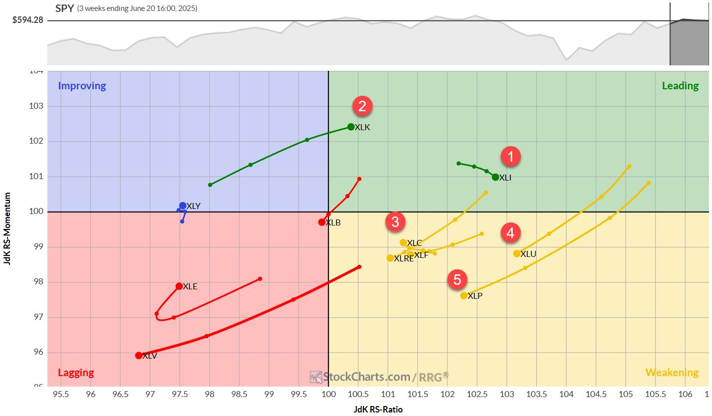
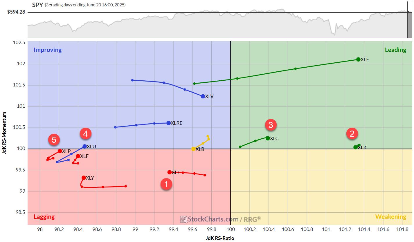
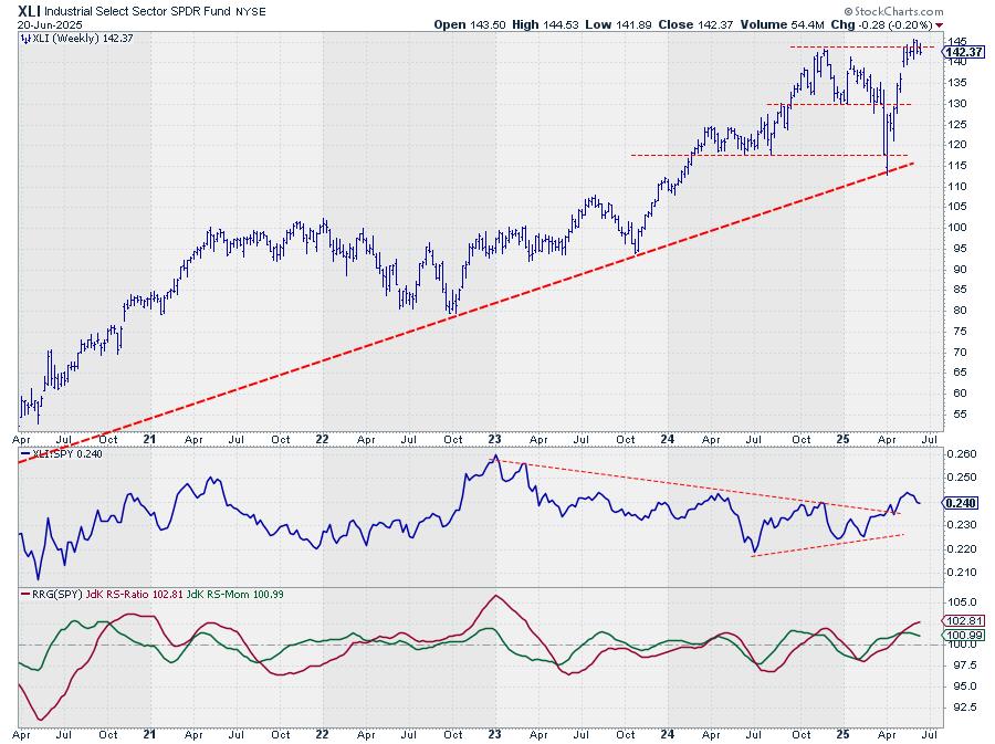
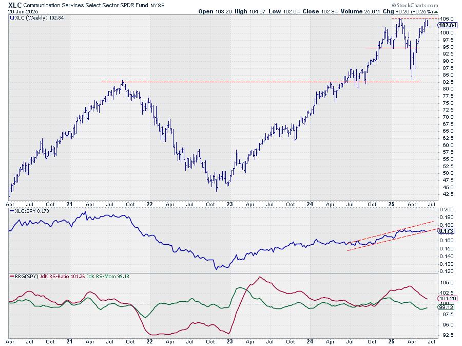
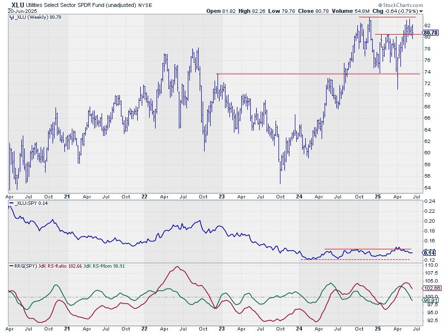
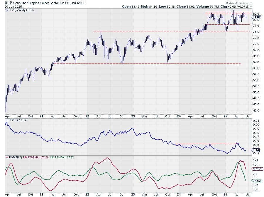


 This week, Julius breaks down the current sector rotation using his signature Relative Rotation Graphs, with XLK vaulting into the leading quadrant while utilities and staples fade. He spotlights strength in the technology sector, led by semiconductors and electronic groups that are outpacing the S&P 500. Microchip heavyweights AMD, NVDA, and AVGO are displaying bullish RRG tails, reinforcing the trend. Communication Services and Energy are gaining momentum as well, rounding out a playbook that rewards disciplined trend-following amid risk from geopolitical headlines.

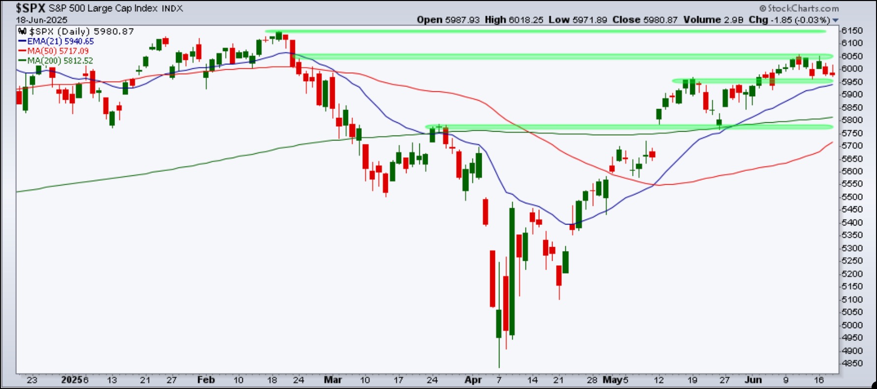
 When the stock market seems to be drifting sideways without displaying a clear bullish or bearish bias, it’s normal for investors to get anxious. It’s like being at a crossroads, wondering whether to go left, right, or stay put.