 Catching a sector early as it rotates out of a slump is one of the more reliable ways to get ahead of an emerging trend. You just have to make sure the rotation has enough strength to follow through.
On Thursday morning, as the markets maintained a cautiously bullish tone, I checked the New Highs panel on the StockCharts Dashboard, scanning the 1-, 3-, 6-, and 9-month highs list. A clear theme emerged—biotech and healthcare stocks dominated the shorter-term highs.
Seeing strength in healthcare and biotech, I checked the Market Summary BPI panel to compare breadth across sectors. Healthcare posted a 63.93% reading—an early sign the sector may be turning higher.
Comparing the broader sector with the biotech industry, the Key Ratios – Offense vs. Defense panel showed that Biotech outperformed Healthcare by a modest 2.31% over the past three months. This panel compares the SPDR S&P Biotech ETF (XBI), which represents the biotech sector, with the broader Health Care Select Sector SPDR Fund (XLV).
Are Biotech and Healthcare Starting a Bullish Rotation?
So, are we seeing an early rotation of both industry and sector toward the upside, and could either be shaping up as an opportunity for investment? Let’s take a comparative look at both relative to the SPDR S&P 500 ETF (SPY), our broad market stand-in.
Comparing XBI and XLV to SPY: Signs of Leadership?
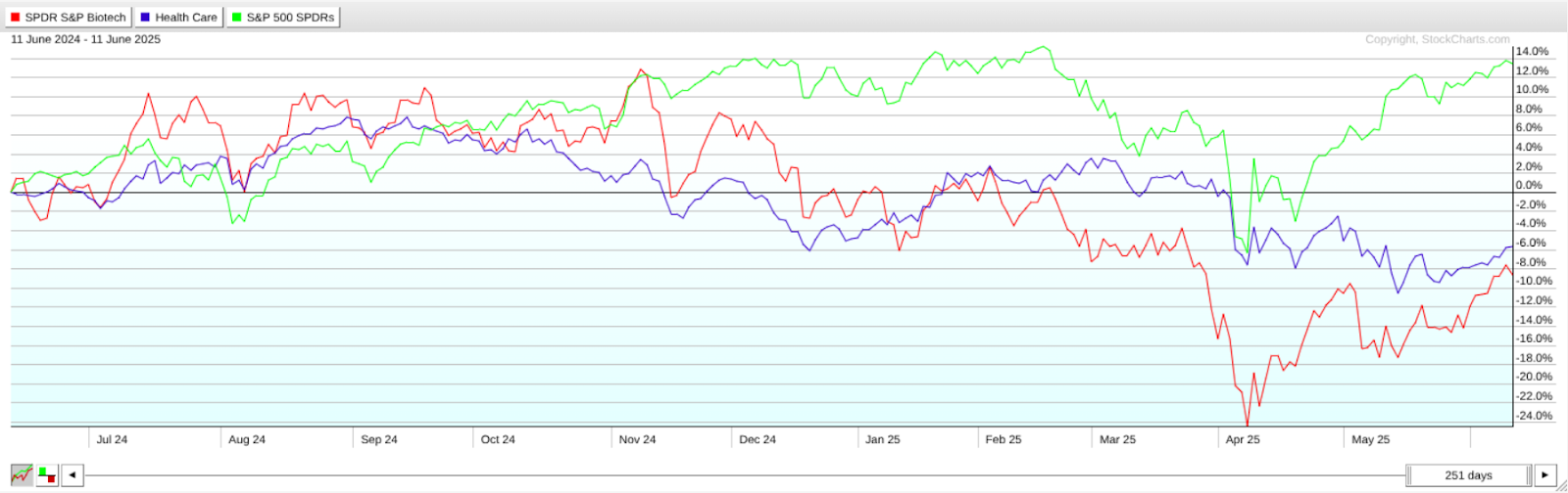
FIGURE 1. PERFCHARTS OF XBI, XLV, AND SPY. This is typical of what you’d see during an early-stage rotation.
This PerfCharts view shows a one-year snapshot of relative performance, with biotech lagging behind healthcare, and both trailing the SPY in negative territory. Yet XBI and XLV are showing signs of recovery, with XBI exhibiting a sharper angle of ascent.
Seasonal Strength in Healthcare and Biotech Stocks
Now here’s an interesting addition to the current analysis: what if we considered the industry and the sector from a seasonality perspective? The reason for this is that certain sectors and the industries within them tend to exhibit recurring patterns of strength or weakness during specific times of the year. If we’re seeing a potential turning point in either, could a seasonality lens offer additional insight or clarity to the analysis?
Biotech Seasonality: Strong Months for XBI
Let’s start with XBI, and notice how it’s now entering a cluster of seasonally-favorable months.
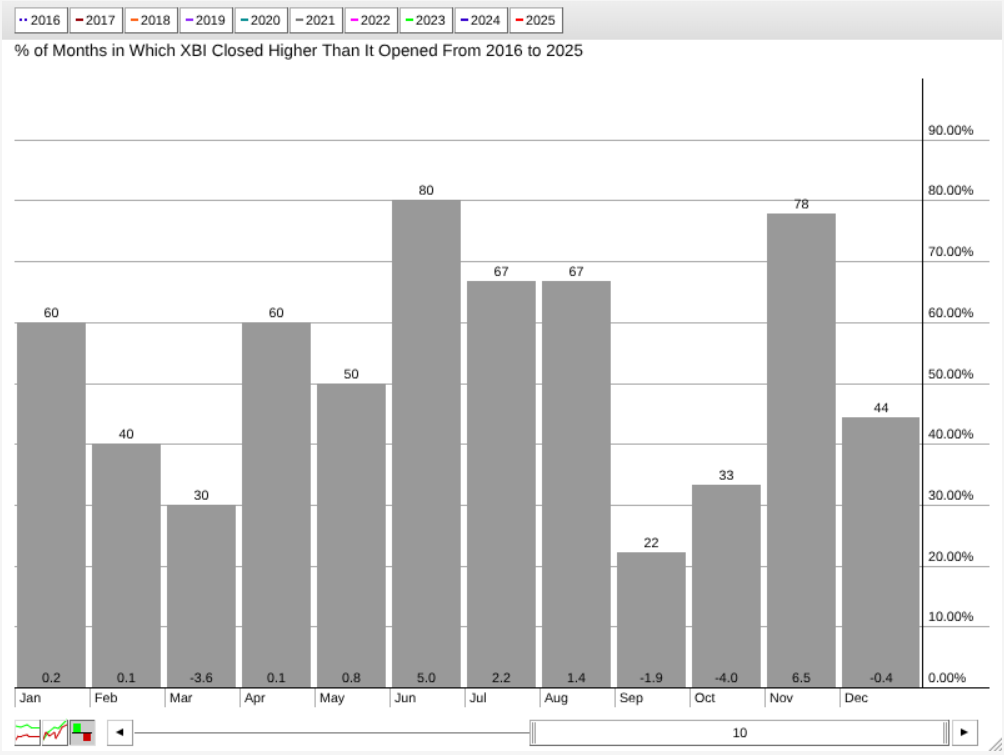
FIGURE 2. SEASONALITY CHART OF XBI. The industry is entering a cluster of seasonally strong months.
According to this 10-year seasonality chart, June, July, August, and November tend to be strong months for XBI, with positive closing rates well above 50% (see figures above each bar) and higher-than-average returns (see figures at the bottom of the bars). Among them, June and November stand out as XBI’s strongest seasonal months.
XLV Seasonality: November Still Reigns
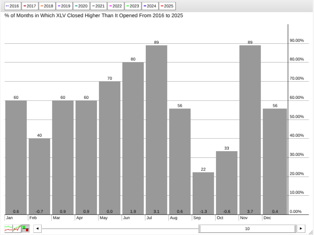
FIGURE 3. SEASONALITY CHART OF XLV. According to this, July is XLV’s second-strongest month after November.
XLV’s seasonal profile shares a similar pattern, with a few key differences. July emerges as XLV’s second-strongest month, boasting a close rate of 89% and an average return of 3.1%. Like XBI, November is XLV’s top month in terms of average return.
What this tells us is that the biotech industry and the broader healthcare sector have historically performed well during these periods (especially November), suggesting that seasonal strength could serve as a tailwind if the current rotation continues to build momentum.
Charting the Rotation: XBI Trend Structure Shows Some Clarity
Next, let’s take a look at their current price action, starting with a daily chart of XBI.
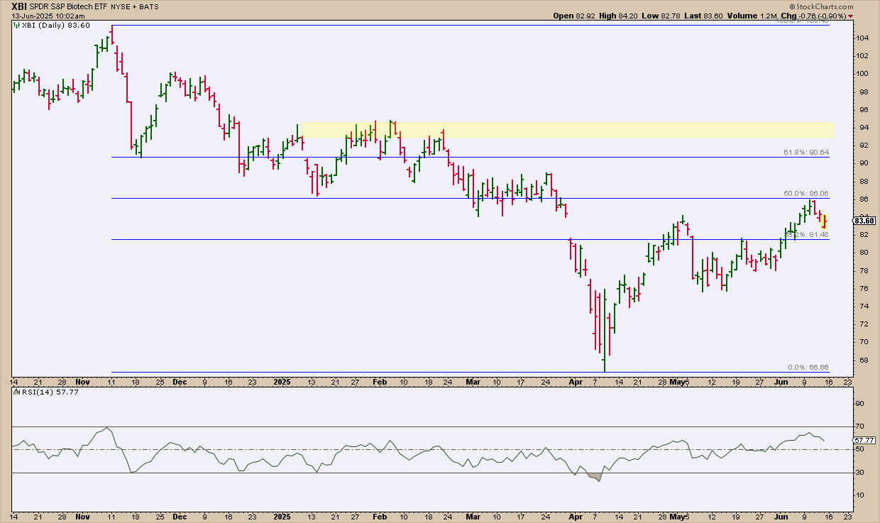
FIGURE 4. DAILY CHART OF XBI. Notice how the trend structure is well-defined by the Fibonacci retracement, providing clear measurements for you to gauge the subsequent directionality once the market decides which way XBI will go.
XBI’s price action shows it reversed at the 50% Fibonacci Retracement level (November high to April low). Will the bears take control, or will XBI’s near-term reaction strengthen into an uptrend, eventually pushing XBI past the 61.8% retracement level, a threshold wherein bears may fold their positions and bulls increase theirs?
In light of the latter, the Relative Strength Index (RSI) is at 61 and rising, indicating room for upside, but only under the condition that the current bullish swing maintains its trajectory.
A few actionable tips. If you’re bullish on XBI and planning to add it to your portfolio, consider the following:
- If XBI were to pull back deeper, watch to see if it bounces near the last recent swing low area at $76.
- If XBI reverses to the upside, expect resistance at the 61.8% Fib retracement at around $91. Also, watch the yellow-shaded zone around $94, an area of concentrated trading activity which may also act as a strong resistance zone.
If XBI rotates in a bullish fashion, these key levels can help guide your analysis.
XLV Technical Setup: Strength, But Not Yet a Breakout
Next, shift over to a daily chart of XLV. You’ll notice it’s quite different despite also exhibiting a recovery.
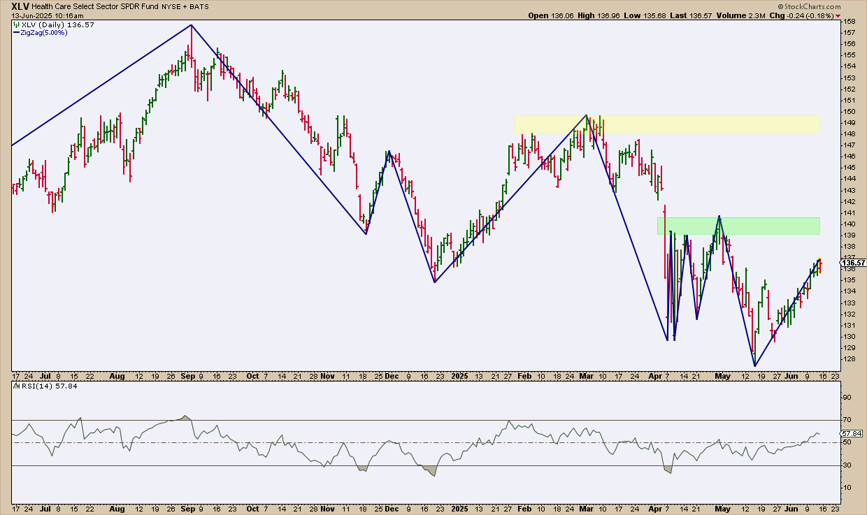
FIGURE 5. DAILY CHART OF XLV. Unlike the previous example, XLV’s price action is more muddled.
XLV’s recovery doesn’t appear as convincing just yet, as it still needs to clear multiple swing highs and resistance levels clustered between $139 and $141 (highlighted in green). If it manages to break above this zone, the next resistance range—shaded in yellow—sits between $148 and $150. In short, the sector proxy faces several hurdles and technical headwinds ahead.
The RSI, at 58 and rising, is nowhere near overbought territory, but it may not immediately indicate bullishness unless XLV is able to establish an uptrend. For now, it isn’t clear if that will happen, so exercise caution.
From an actionable standpoint, the current technical structure doesn’t offer a clear entry setup. That’s largely because the trend lacks a well-defined sequence of higher swing highs and higher swing lows—something you’d typically look for when establishing favorable entry and exit positions.
At the Close
If healthcare and biotech are starting to rotate higher, XBI and XLV are the charts to watch. XBI shows a stronger trend structure, while XLV still faces resistance. With seasonality on their side, add them to your ChartLists to track key levels and price action.

Disclaimer: This blog is for educational purposes only and should not be construed as financial advice. The ideas and strategies should never be used without first assessing your own personal and financial situation, or without consulting a financial professional.


 Grayson explores a hidden gem on the SharpCharts platform: StyleButtons! These handy little customizable tabs give you quick, one-click access to your favorite chart templates, allowing you to jump from ChartStyle to ChartStyle with a seriously streamlined charting workflow. Grayson demonstrates how to create and save ChartStyles and assign them to StyleButtons in your account – a major efficiency boost for all StockCharts users! Plus, he describes how he uses StyleButtons to make multi-timeframe analysis a breeze and explain his unique “indicator layering” approach to ChartStyles.
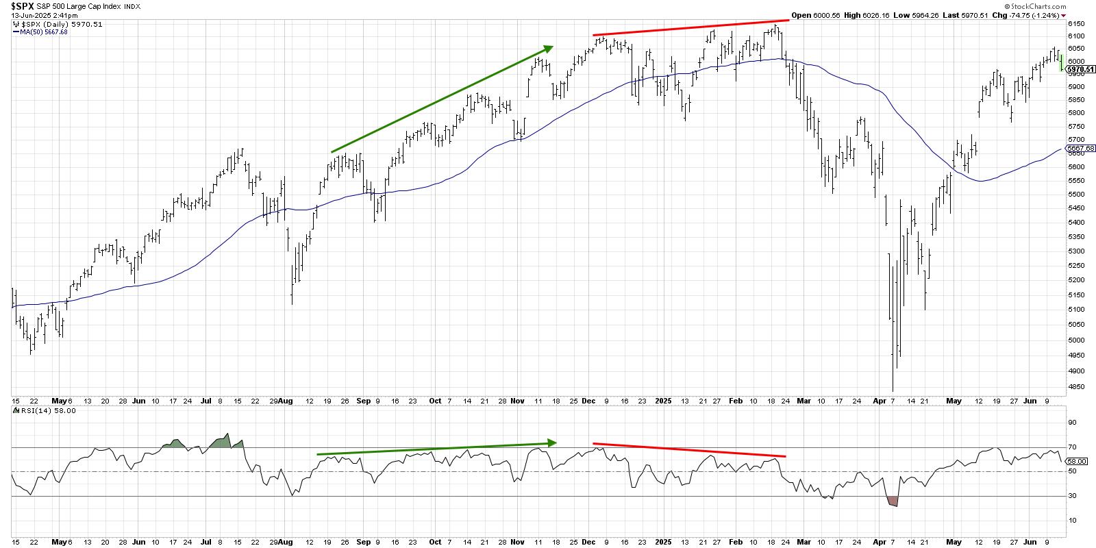
 Joe presents his game-changing “undercut and rally” trading pattern, which can be found in high volatility conditions and observed via RSI, MACD and ADX signals. Joe uses the S&P 500 ETF as a live case study, with its fast shake-out below support followed by an equally quick rebound; a good illustration of why lagging indicators can’t be trusted right after a vertical drop.
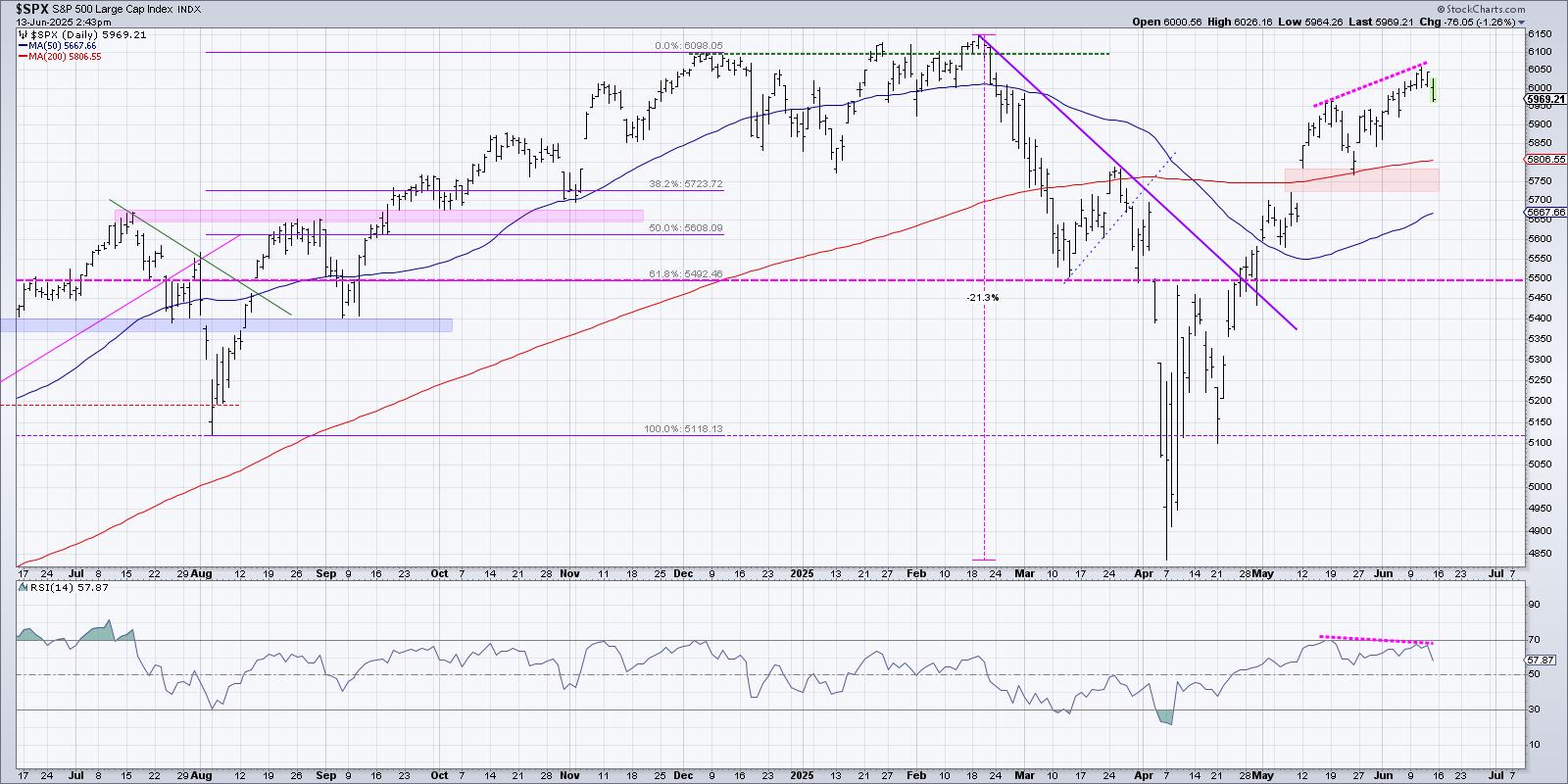
 Follow along with Frank as he presents the outlook for the S&P 500, using three key charts to spot bullish breakouts, pullback zones, and MACD signals. Frank compares bearish and bullish setups using his pattern grid, analyzing which of the two is on top, and explains why he’s eyeing SMCI and AMD as potential trades. From there, he wraps the show with a look at some ETF plays.
 When you see headlines about geopolitical tensions and how the stock market sold off on the news, it can feel unsettling, especially when it comes to your hard-earned savings. But what you might not hear about in the news is what the charts are indicating.
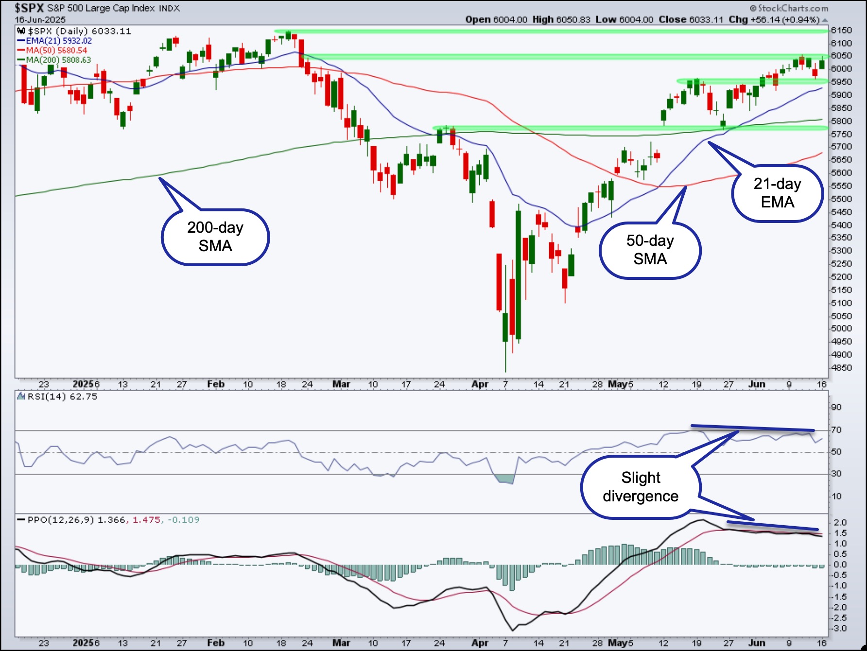


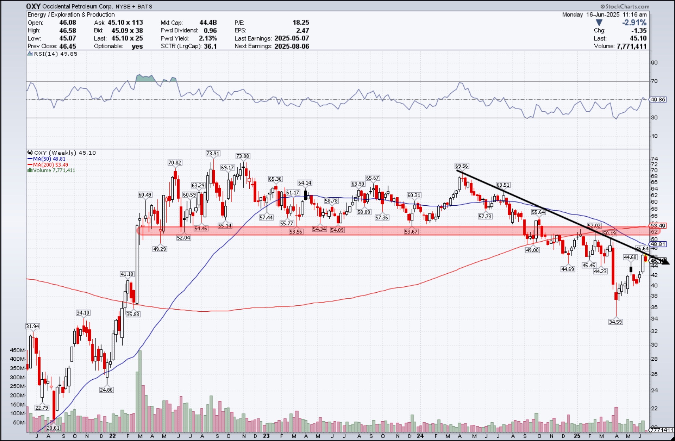
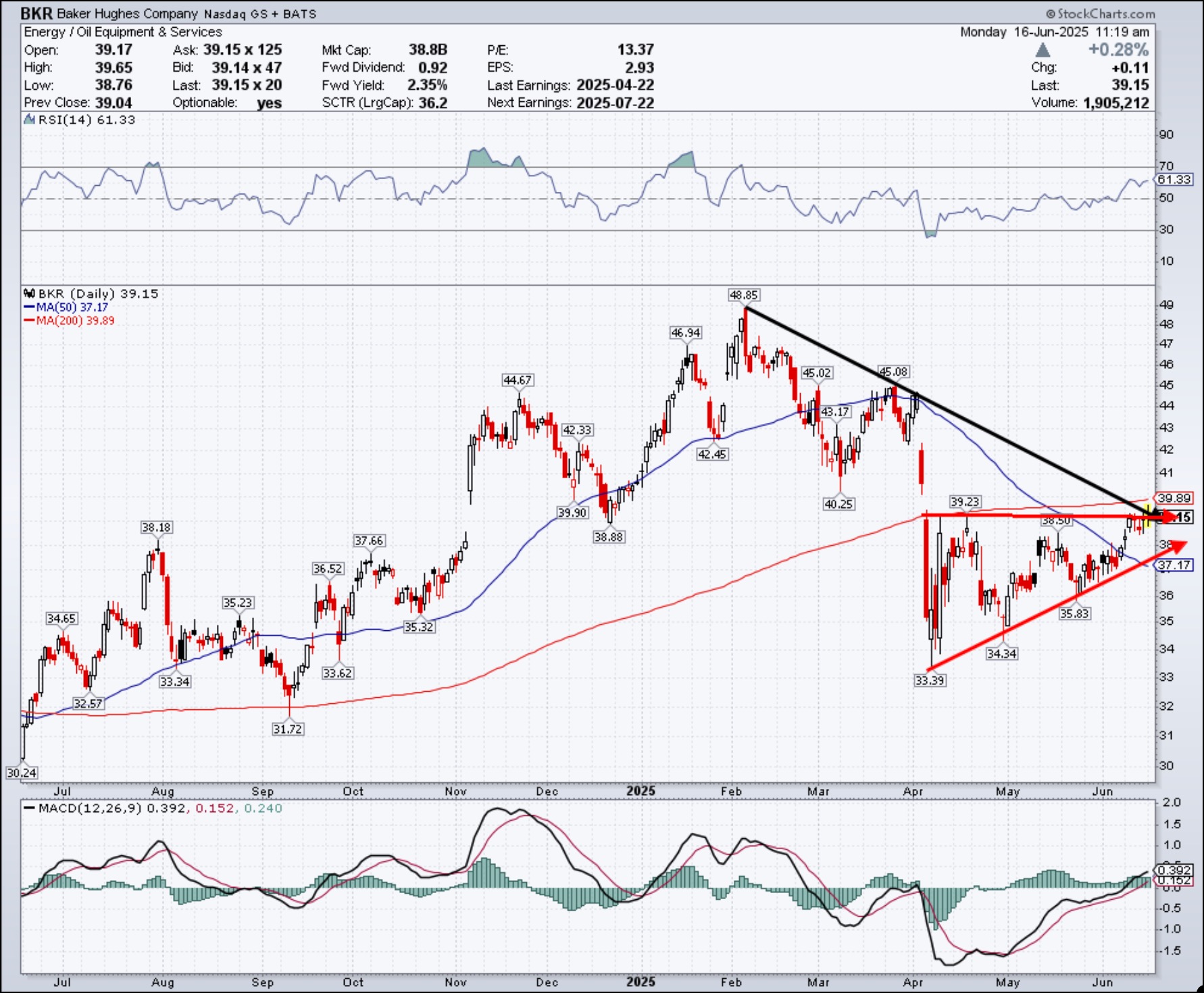
 With oil prices surging and geopolitical unrest stirring in the Middle East, it’s no surprise that energy stocks are drawing renewed attention. And, quite frankly, this week didn’t have many market-moving earnings. So this week, we skate to where the puck is, or, in this case, where traders’ eyes will be focused—the Energy sector.
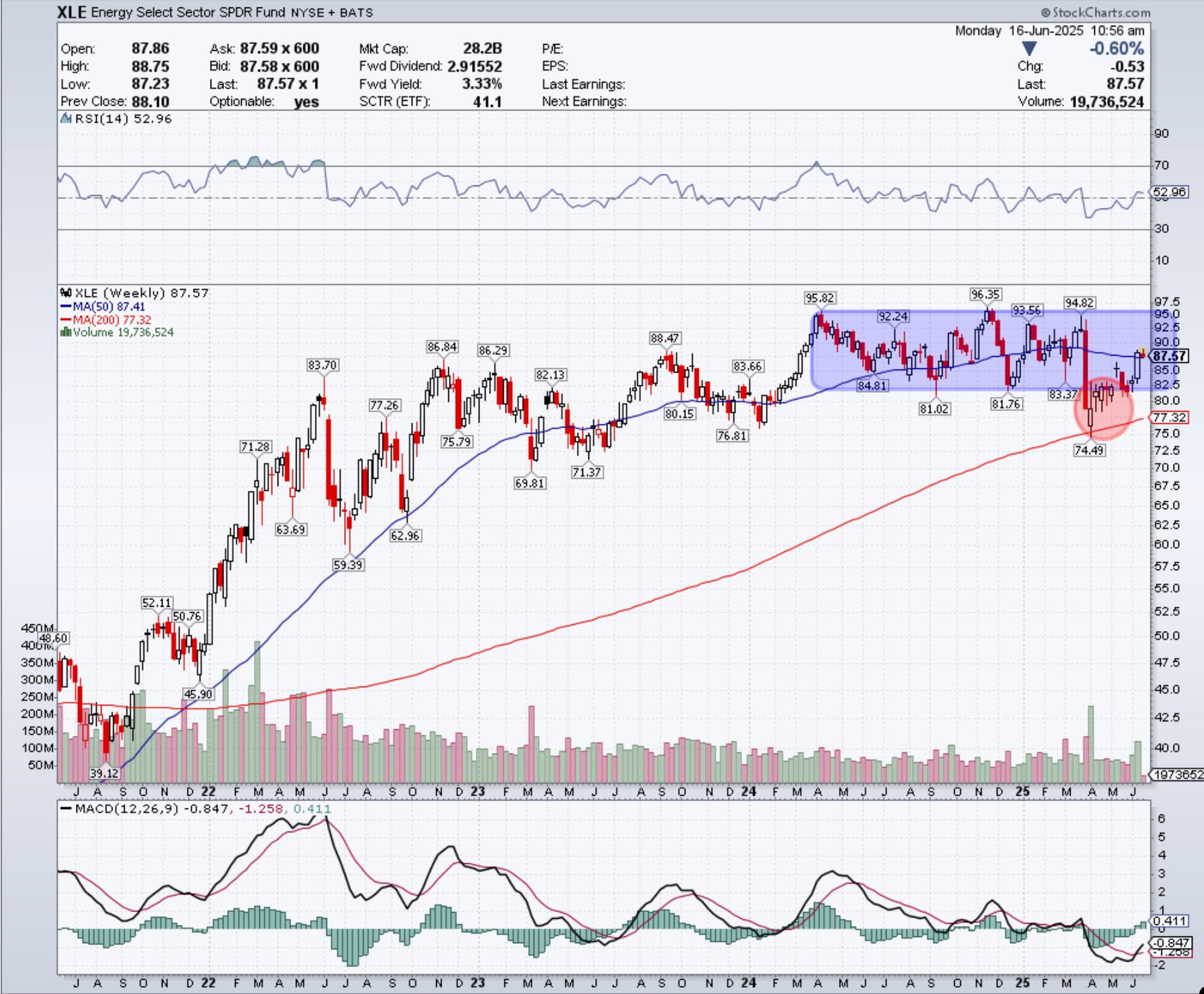


 In this video