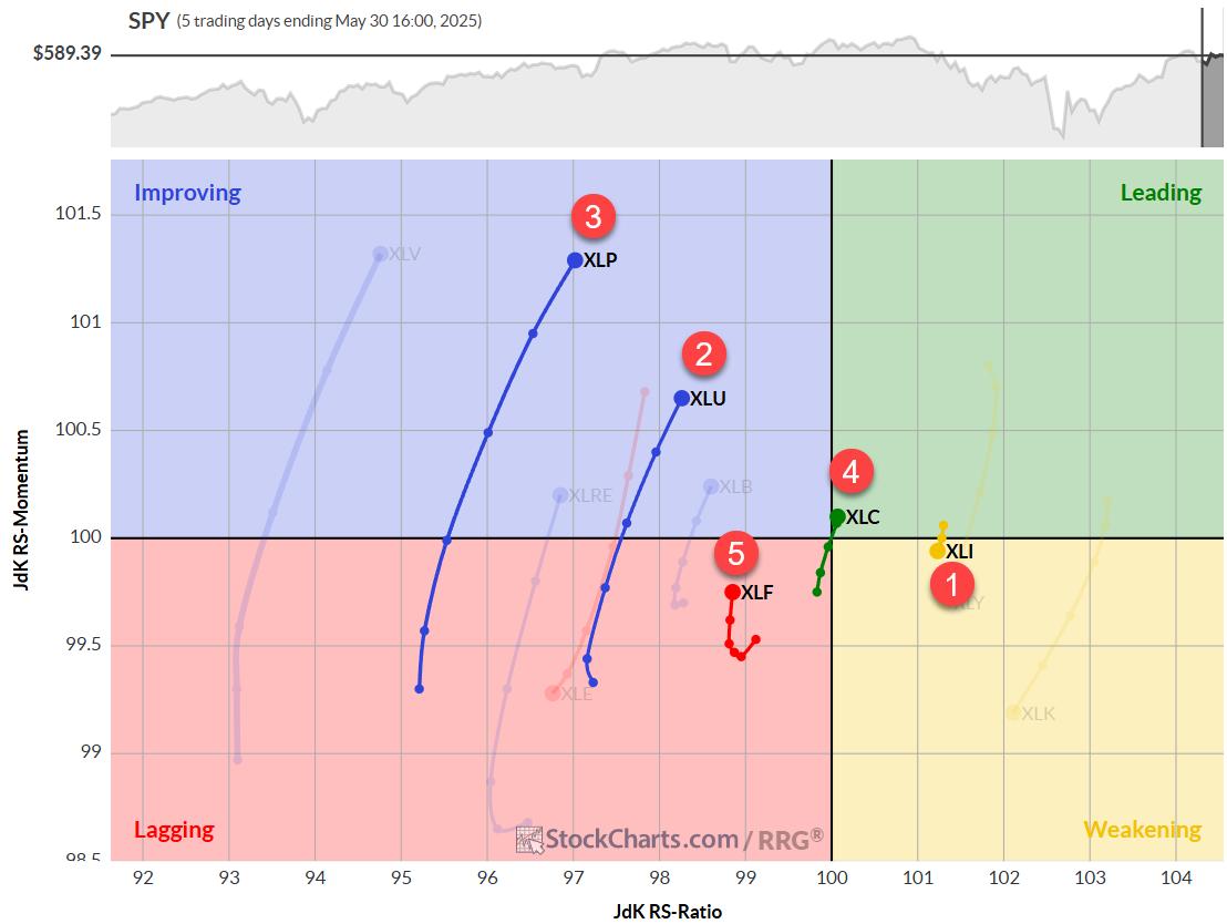
Nuclear energy stocks are on a tear, and Oklo Inc. (OKLO), Cameco Corp. (CCJ), and NuScale Power Corporation (SMR) are leading the charge, fueled by presidential executive orders, investor hype, and hopes for a nuclear-powered future.
Is It Time to Go Nuclear?
These names bucked the trend on Wednesday, rising even as the major U.S. indexes fell. I found all three while running a P&F Double Top Breakout scan, with SMR also appearing in the New 52-Week Highs scan. But are these gains a sign of genuine investment opportunities, or is this high-risk subsector just radioactive for your portfolio? To analyze this, let’s break down their profiles and charts to see whether the “glow” here points to real promise—or simply masks a toxic risk.
Here’s a PerfCharts snapshot of all three stocks against the SPDR S&P 500 ETF (SPY), our broader market proxy.
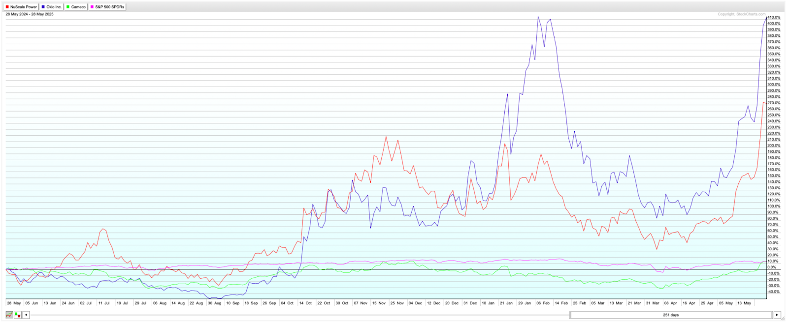 FIGURE 1. PERFCHARTS OF SMR, OKLO, CCJ, AND SPY.
While CCJ steadily lagged behind the S&P 500 until this month, both OKLO and SMR began outperforming the broader market starting in mid-October of last year. Their relative performance to date is so strong that it appears almost unsustainable in the short term.
All three mid-cap stocks are also showing robust StockCharts Technical Rank (SCTR) scores—OKLO at 99.6, SMR at 99.3, and CCJ at 89.9 at the time of writing. While this can indicate technical strength, it can also signal irrational exuberance among retail investors.
Robust SCTR Scores but Divergent Fundamentals
Another thing to note is the notable difference in their fundamentals. SMR and OKLO have negative P/E ratios, suggesting that their surges are driven more by promise and speculation than by profits. CCJ, with a P/E ratio of 149, is raking in some profits, but may also be riding an overcrowded wave of hype.
Ultimately, while technical performance can sometimes lead to fundamental strength—or mask fundamental weakness—it’s worth taking a closer look at these leading names in the nuclear subsector to understand the opportunities and risks they present. Let’s break it down further by examining each stock’s technical picture and what it suggests about investor conviction.
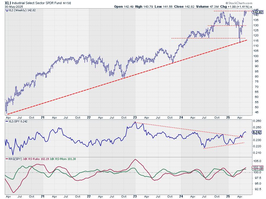
OKLO: Testing Highs, Buying the Dip?
To start, here’s a daily chart of nuclear energy startup OKLO.
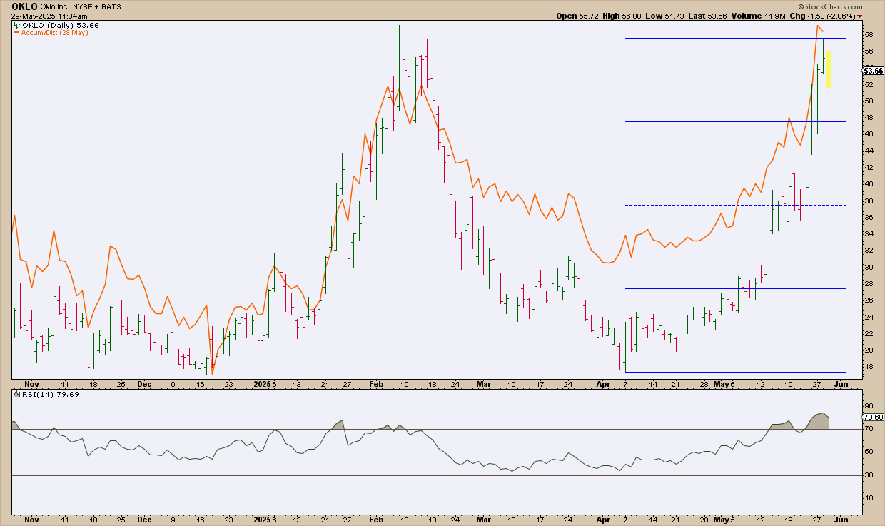 FIGURE 2. DAILY CHART OF OKLO. In contrast to the other two nuclear stocks, OKLO is potentially experiencing higher levels of accumulation.
OKLO recently tested its all-time high of $59 before pulling back. The Relative Strength Index (RSI) shows the stock was deep within overbought territory, hinting at caution. Still, what’s interesting is that OKLO’s Accumulation/Distribution Line (ADL), plotted behind the price, remains strong. This suggests that even as the price retreats, buying pressure may still be present—hinting that investors might be looking to buy the dip rather than “sell the news.”
The key thing to watch now is how deep this retracement goes. If investors are still optimistic about OKLO’s fundamental outlook, you might see a bounce within the first two quadrants marked by the Quadrant Lines on the chart. Pay particular attention to the critical support range around the center line at $38, shown in the yellow-shaded area. If the price falls below this level, it could be a sign of weakness, suggesting the stock is more of a FOMO-driven trade than one backed by long-term conviction.
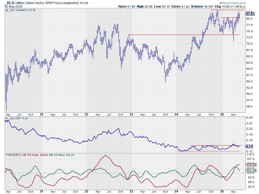
SMR: Hype or Healthy Pullback?
Next, we’ll shift over to a daily chart of SMR. Among the three, SMR is the only to notch a new all-time high. But does this signal the beginning of a new leg up, or the end of a surge that lacks substance?
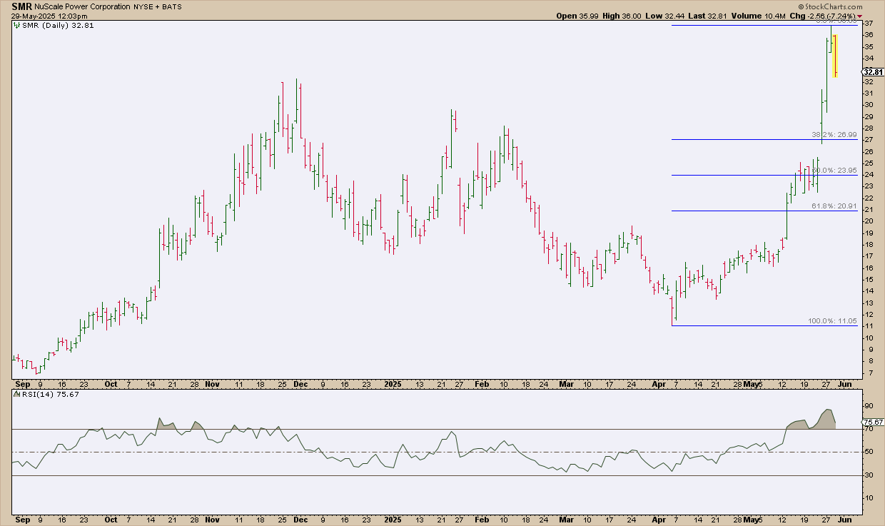 FIGURE 3. DAILY CHART OF SMR. What happens next will show whether investors truly believe in the stock—or if the rally was driven by short-term hype.
SMR immediately declined after making a parabolic move to a new all-time high. As the RSI confirms, the stock was well-overbought. Now, it’s a matter of measuring the depth of the pullback.
I plotted a Fibonacci Retracement to highlight potential support levels. There are several zones of support from previous swing highs and a concentrated trading area between the 61.8% and 38.2% retracement levels. If investor confidence stays strong, expect a possible bounce between $21 and $24, marking the 61.8% and 50% Fib levels respectively. A deeper drop below the 61.8% level might still find support around $15, but that would also suggest that the rally was driven more by sentiment than strategic conviction.
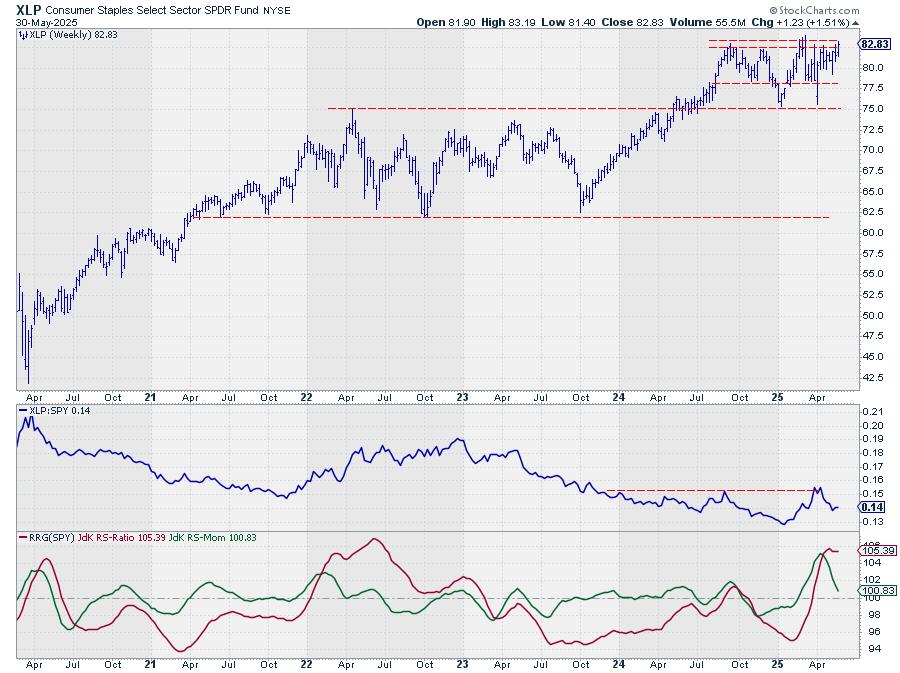
CCJ: Underperforming Stock, Profitable Company
Lastly, let’s take a look at the most earnings-positive company among the three. Here’s a daily chart of CCJ.
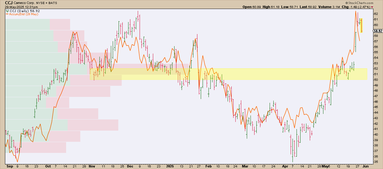 FIGURE 4. DAILY CHART OF CCJ. The critical level to watch is the range between $50 – $52.
CCJ has a similar technical profile to OKLO and SMR—it’s overbought, and it tested its all-time high on a parabolic surge, leading to a pullback.
However, instead of measuring the various degrees of its potential retracements (using Fib or Quadrants), I’m focusing on the key range of $50–$52. Why? Because, in addition to marking a broad level that has acted as both support and resistance since October of last year, this range also shows a high concentration of trading activity, as indicated by the Volume-by-Price indicator.
If longer-term conviction holds, CCJ should bounce at this level. If not, expect the stock to decline further—although it may eventually find support at lower levels, it likely wouldn’t be worth chasing at that point.
At the Close
Nuclear energy stocks like OKLO, SMR, and CCJ have captured market attention, defying broader trends and flashing bullish technical patterns. But while momentum and investor enthusiasm are driving these moves, each stock also faces questions about sustainability and fundamentals.
Are we looking at a healthy dip—or is Wall Street just selling the news? To answer that question, keep an eye on the key technical levels outlined above. With these standout names in an emerging (and therefore highly uncertain) subsector, the technicals will likely reveal whether the market’s leaning toward conviction or just chasing the hype.

Disclaimer: This blog is for educational purposes only and should not be construed as financial advice. The ideas and strategies should never be used without first assessing your personal and financial situation, or without consulting a financial professional.

")
 In this video, Dave shares his weekly stock scan strategy used to identify bullish stock trends. He illustrates how to set up this powerful scan, reveals the tips and tricks he uses to identify the most constructive patterns, and explains the four winning chart setups that tend to come up week after week.


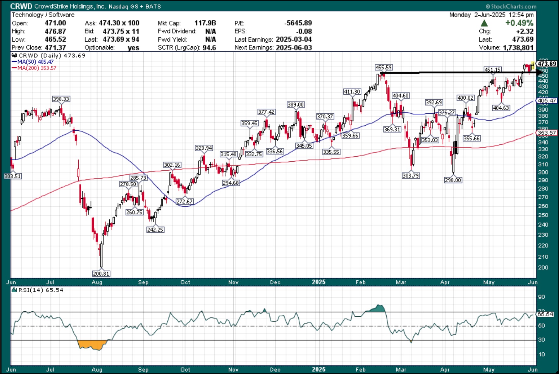
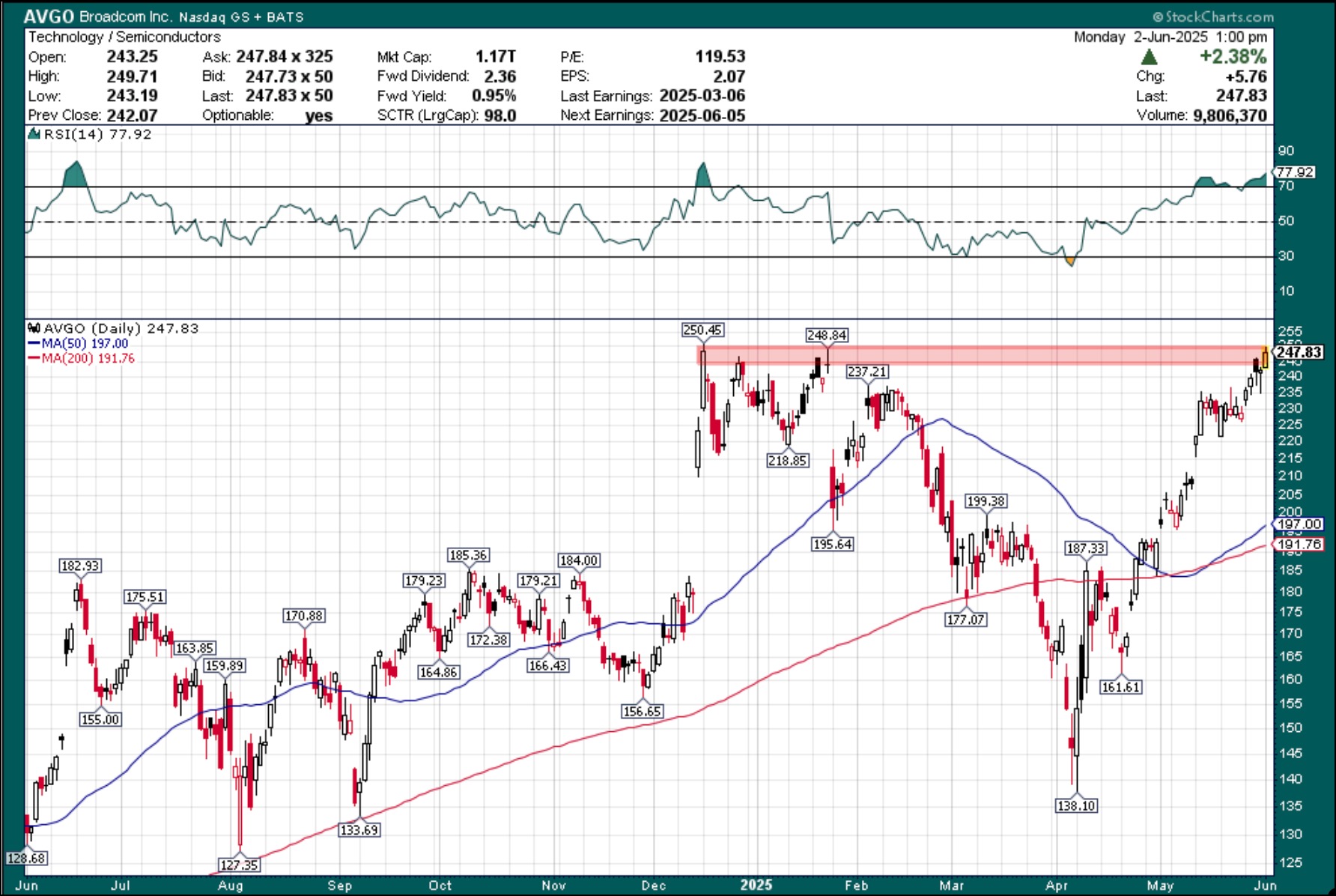
 Earnings season may be winding down, but a few standout names could still make headlines this week. If you’re looking for potential moves, keep an eye on these three stocks — Dollar Tree, Inc. (DLTR), CrowdStrike Holdings, Inc. (CRWD), and Broadcom, Inc. (AVGO).
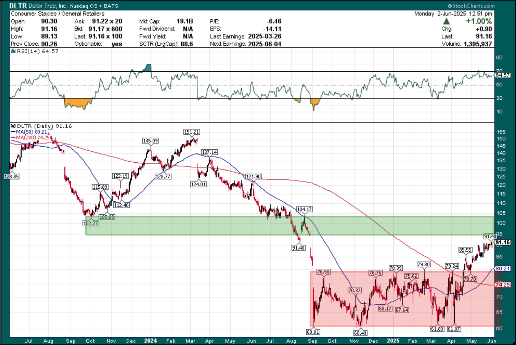


 Discover the top 10 stock charts to watch this month with Grayson Roze and David Keller, CMT. From breakout strategies to moving average setups, the duo walk through technical analysis techniques using relative strength, momentum, and trend-following indicators.


 Manage your stock portfolio like a pro! Learn stock portfolio management, trading strategy, and how to build stock watchlists like a professional investor with this insightful video from Grayson. He shares how to run your portfolio like a championship sports team—organizing stocks like players, keeping top performers in play, and tracking trade opportunities with precision.