Technology Back in Top-5
Last week’s market decline of 2-2.5% (depending on the index) has led to some notable shifts in sector performance and rankings.
This pullback, coming after a strong rally, is changing the order of highs and lows on the weekly chart — a particularly significant development, at least for me.
Let’s dive into the details and see what’s flying around in the market.
The composition of the top five sectors has seen some notable changes. Here’s how it stands now:
The big surprise here is Technology making its way into the top five, displacing Consumer Staples (now at #6). This shift suggests a gradual move from a more defensive positioning to sectors that are more cyclical and economically sensitive.
Another eye-catching move comes from Consumer Discretionary, jumping from #10 to #7 — a significant leap, albeit still in the bottom half of the ranking. Real Estate and Materials saw minor shifts, while Energy dropped to #10 and Health Care remains at #11.
- (1) Industrials – (XLI)
- (4) Communication Services – (XLC)*
- (3) Utilities – (XLU)
- (2) Financials – (XLF)*
- (6) Technology – (XLK)*
- (5) Consumer Staples – (XLP)*
- (10) Consumer Discretionary – (XLY)*
- (7) Real-Estate – (XLRE)*
- (8) Materials – (XLB)*
- (9) Energy – (XLE)*
- (11) Healthcare – (XLV)
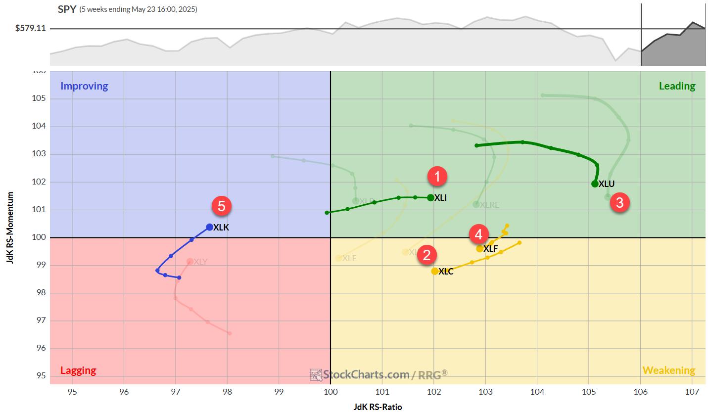
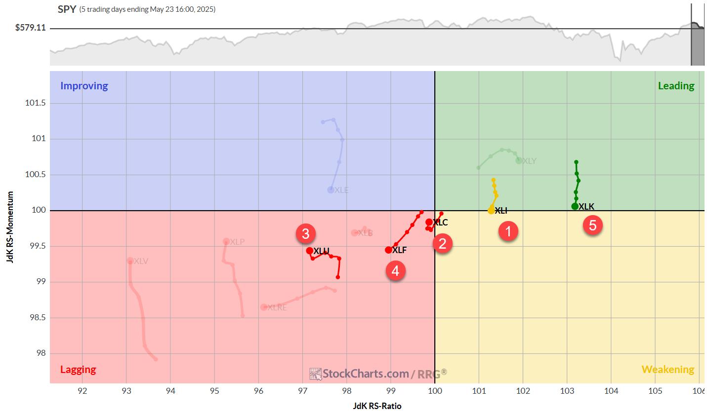
Weekly/Daily RRG Analysis
The weekly Relative Rotation Graph (RRG) provides some interesting insights:
- Utilities maintains very high readings, but Consumer Staples (highest on RS-Ratio ranking) is likely to be pushed down by weak daily chart readings.
- Industrials continues to push further into the leading quadrant with stable momentum.
- Financials and Communication Services are inside the weakening quadrant but have room to curl back towards leading.
- Technology, despite having the second-lowest RS-Ratio reading, is rapidly improving with a strong RS-Momentum heading over recent weeks.
Remember, the ranking combines daily and weekly readings.
Technology’s high daily chart reading is propelling it into the top five, while Consumer Staples’ weak daily reading is pushing it out.
Industrials: The Leader Holding Strong
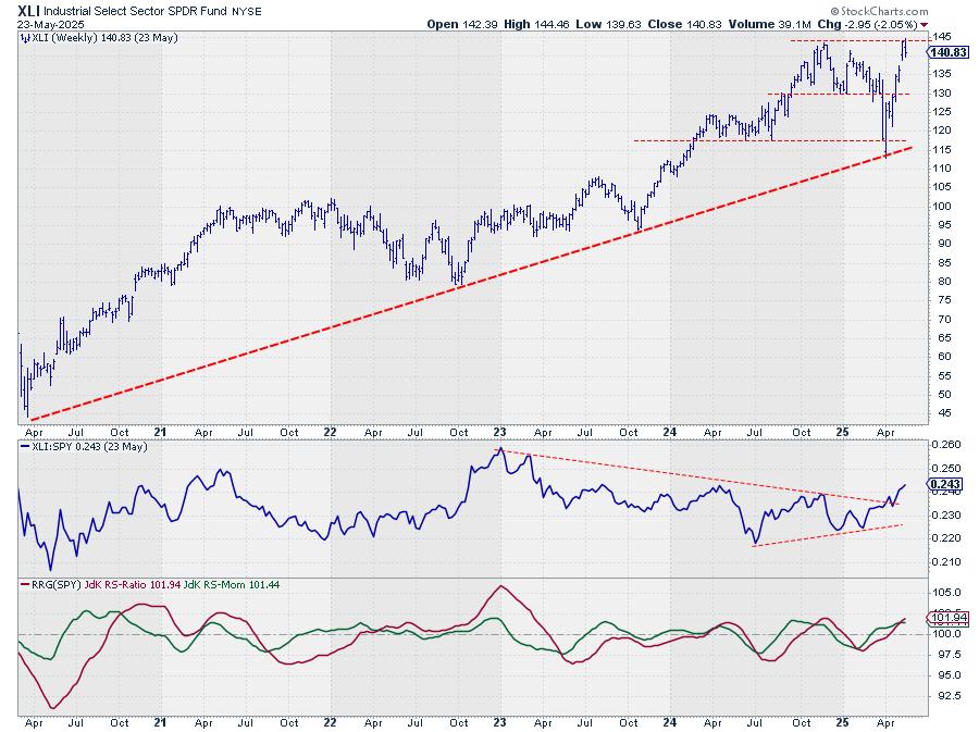
XLI is now pushing against its all-time high, just below 145. After two weeks of attempts, last week’s slight market decline confirms that this resistance level has worked.
We’re now looking for where any potential decline might stop and form a new low. The gap area from two weeks ago seems to be a good support area to watch.
The relative strength line breaking out of its consolidation formation continues to drag the RRG lines higher. XLI, for good reason, remains the strongest sector at the moment.
Communication Services: Stable Relative Uptrend
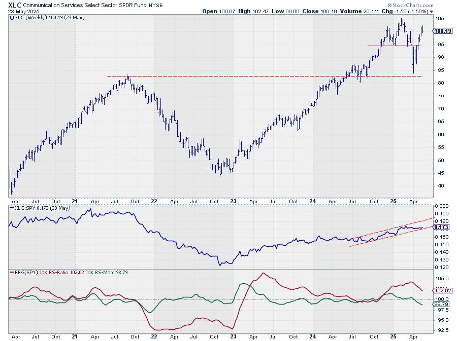
XLC is continuing its move higher with remarkable stability. The uptrend in the RS line is still valid, currently testing the lower boundary of the rising channel.
Due to the lack of upward relative momentum in recent weeks, both RRG lines are now pointing lower.
However, the RS-Ratio line remains well above 100, keeping the XLC tail on the right-hand side of the RRG.
Utilities: Testing Resistance
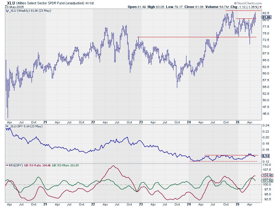
XLU is pushing against overhead resistance but has yet to manage a decisive break higher.
With defensive sectors under pressure, it’s questionable whether this breakout will happen in the short term.
The RS line versus SPY is dropping back into its trading range, unable to break away decisively. This drop is causing the RS-Momentum line to roll over and start pointing lower.
It’s the recent strength in relative strength that’s keeping Utilities inside the leading quadrant for now.
Financials: At a Crossroads
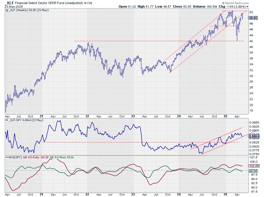
The Financial sector seems to be respecting the old rising support line as resistance, with the market dropping off that line last week and now trading around $50.
This move is affecting the relative strength line, which has returned to the lower boundary of the rising channel — a level that needs to hold to maintain a positive outlook for XLF.
The RS-Ratio line is stable around 102.50, high enough to keep Financials on the right-hand side of the graph.
The RS-Momentum line has just dropped below 100, positioning the XLF tail inside the weakening quadrant, but with enough room to curl back up before hitting lagging.
Technology: The Week’s Winner
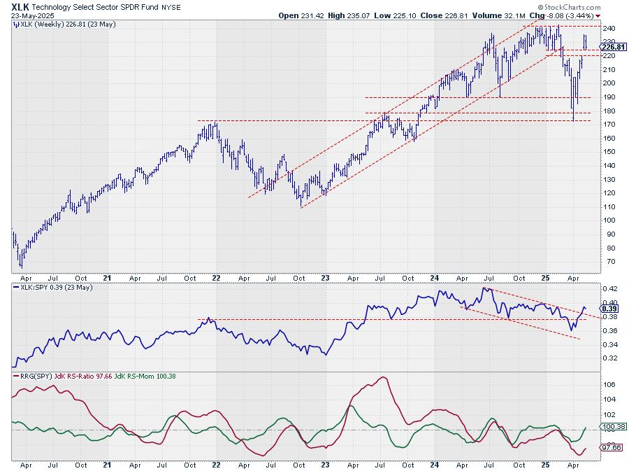
XLK saw a significant jump two weeks ago and has since returned to test the old resistance area as support. If last week’s decline continues, there’s a bit more room to the downside — $220 seems to be a good level to watch for support, marking the bottom of the gap range from two weeks ago.
The jump has pushed the relative strength line above its falling resistance line, a good sign that seems to be breaking the relative downtrend in place since mid-last year.
This is changing the characteristics of the relative strength move for the Technology sector.
For now, it has only pushed the RS-Momentum line above 100, moving XLK into the improving quadrant on the weekly RRG, but it’s already starting to drag the RS-Ratio line higher.
Portfolio Performance
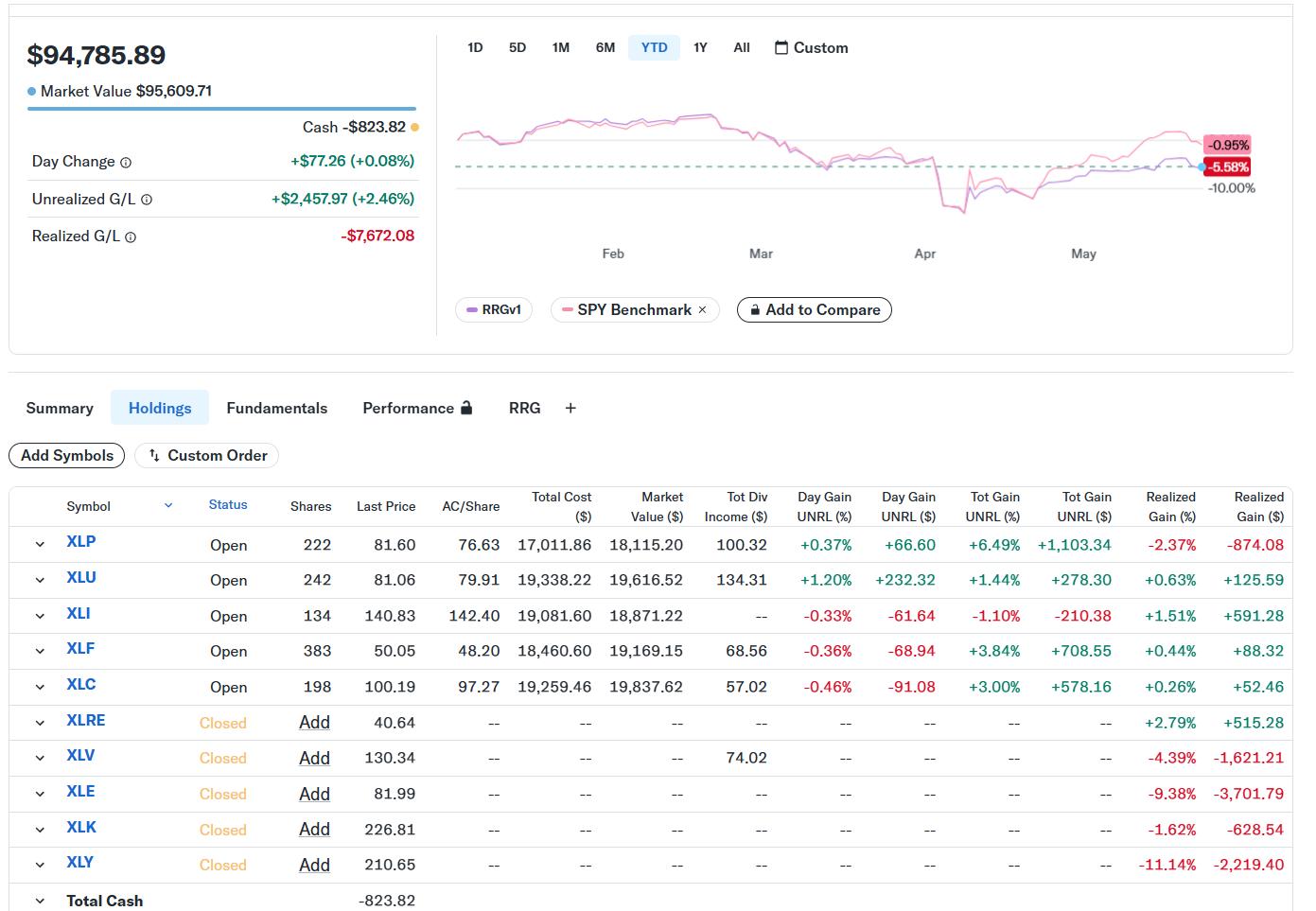
We’re clawing back some of the losses from recent weeks. The underperformance of almost 6% last week has now shrunk to 4.6%. Still behind the benchmark, but closing in again and narrowing the gap.
It’s a long-term game, so we keep pushing forward. So far, nothing out of the ordinary. Let’s wait and see whether we’ve seen the low in underperformance and how long it will take to return to SPY’s performance since inception.
#StayAlert –Julius


 In this video, Joe analyzes which sectors to focus on when selecting new stocks. He demonstrates how to use the 18-period simple moving average (SMA) on monthly, weekly, and daily charts to identify the strongest stock patterns and the best timeframes to trade. He then provides chart analysis on the QQQ, IWM, and Bitcoin, before reviewing this week’s symbol requests submitted by viewers.
 In this must-see market update, Larry Williams returns with timely stock market analysis, trading insights, and macroeconomic forecasts. Discover what’s next for the Federal Reserve, interest rates, and inflation — and how it could impact top stocks like Tesla (TSLA), Nvidia (NVDA), Apple (AAPL), and consumer staples (XLP).
 In this video, Chip Anderson, President of StockCharts, sits down with Tony for a conversation in the StockCharts studio! During this in-depth Q&A session, Chip and Tony explore the powerful features that make the OptionsPlay add-on a must-have for options traders using the StockCharts platform. They discuss the integration of the StockCharts Scanning Engine with OptionsPlay strategies—showcasing how this tool enhances your ability to find trade setups quickly and effectively.
 Confused by mixed market signals? Follow along as Julius analyzes sector rotation, asset rotation, and global market trends using daily and weekly Relative Rotation Graphs (RRGs).