The overall trend in the stock market’s broader indexes remains bullish. While the indexes were trading lower on Tuesday morning, they rebounded and ended the day relatively flat. The S&P 500 ($SPX) and Dow ($INDU) closed slightly lower, and the Nasdaq Composite ($COMPQ) closed a little higher.
Consumer Staples Sector Leads
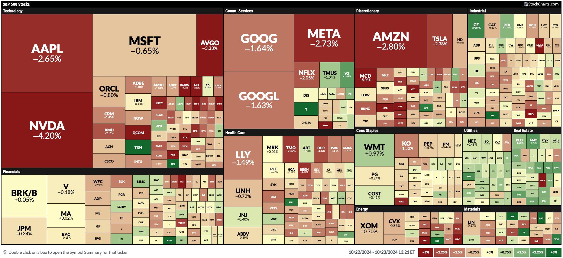
Philip Morris International (PM) reported better-than-expected earnings, which increased the stock by 10.46% on Tuesday, making it the top performer in the S&P 500 (see MarketCarpet below). Walmart (WMT) was another stock that helped the Consumer Staples sector secure the top spot in Tuesday’s S&P 500 sector performance. WMT is the heaviest-weighted stock in the Consumer Staples sector, and it closed up by 1.51%, notching an all-time high.
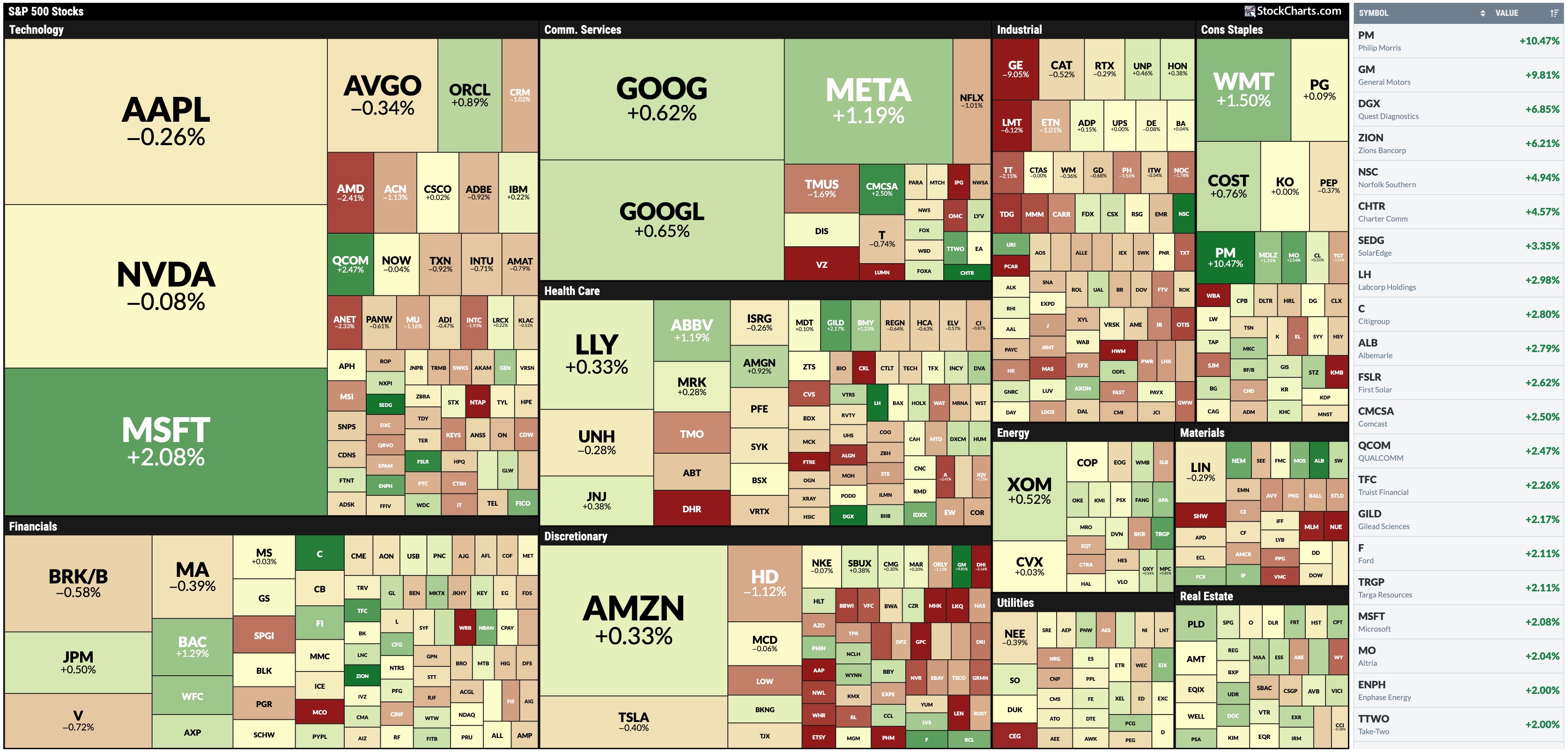
FIGURE 1. MARKETCARPET FOR OCTOBER 22. Consumer Staples was the best-performing sector, mainly due to strong earnings from Phillip Morris.Image source: StockCharts.com. For educational purposes.
It’s worth viewing a daily chart of the Consumer Staples sector using the Consumer Staples Select Sector SPDR ETF (XLP) as a proxy.
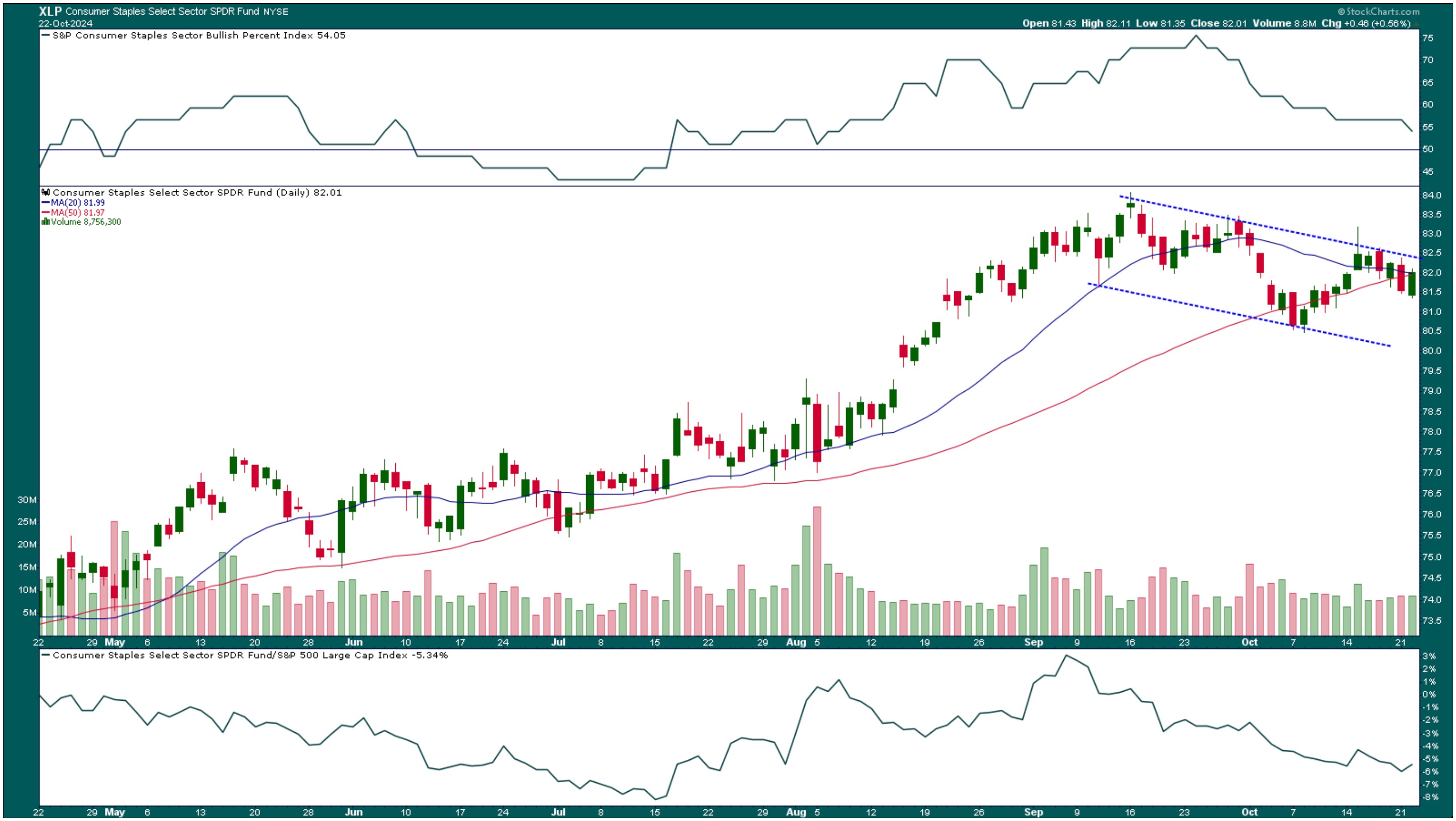
FIGURE 2. DAILY CHART OF CONSUMER STAPLES SELECT SECTOR SPDR FUND (XLP). Although it was Tuesday’s leading sector, overall, it’s been trending lower. The S&P Consumer Staples Bullish Percent Index and its relative performance against the S&P 500 confirm the lack of momentum in this sector.Chart source: StockCharts.com. For educational purposes.
After hitting a high in mid-September, XLP has been trending downward within a channel. The S&P Consumer Staples Bullish Percent Index ($BPSTAP) is also trending lower, approaching the 50 level. A move below 50 would be bearish for the sector. XLP’s relative performance with respect to the S&P 500 is at -5.34%.
Overall, even though XLP was the highest sector performer on Tuesday, indicators point to a slightly weakening sector.
Tech Leads In One-Month Performance
If you look at a one-month performance of the 11 S&P 500 sectors, XLP sits in the bottom three. Technology is the leading sector in one-month performance. The Technology Select Sector SPDR ETF (XLK) is in a consolidation similar to the Nasdaq Composite ($COMPQ).
The Nasdaq has been moving sideways for the last week, but saw some action on Tuesday afternoon. If you look at the chart below, you can see the Nasdaq managed to maintain the support of the triangle and broke out above resistance. It looks like the Nasdaq wants to spring to the upside; it’s only 0.4% from its high. Maybe it’s pre-earnings anxiety. Most of the mega-cap tech stocks will be reporting quarterly earnings next week, so it could be getting a head start.
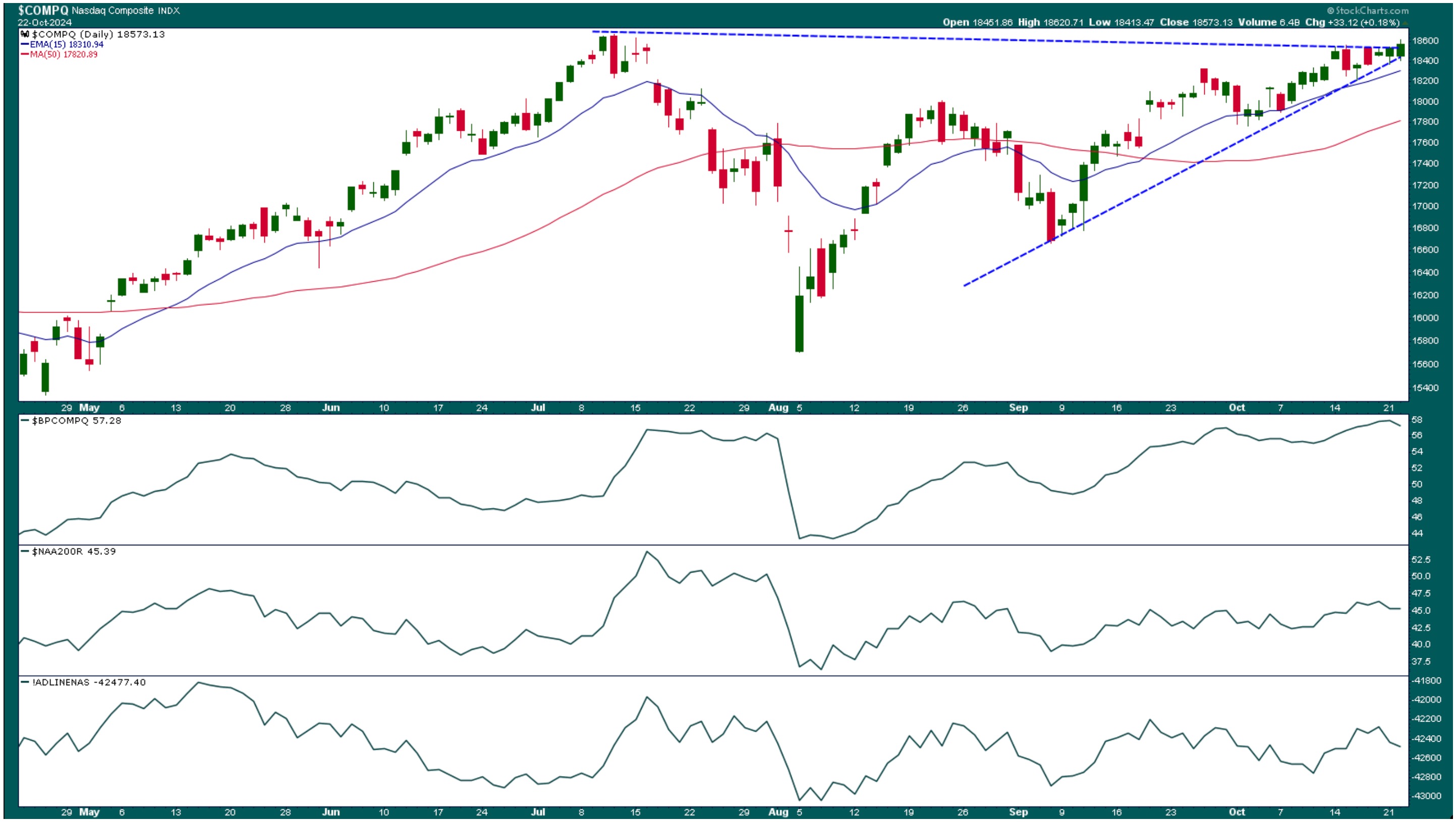
FIGURE 3. DAILY CHART OF NASDAQ COMPOSITE. The Nasdaq is in a narrow consolidation at the apex of a triangle. Which way will it break out? Look for the breadth indicators to confirm the direction.Chart source: StockCharts.com. For educational purposes.
The three breadth indicators—the Nasdaq Composite Bullish Percent Index ($BPCOMPQ), the percentage of Nasdaq stocks trading above their 200-day moving average ($NAA200R), and the Nasdaq Advance-Decline line (!ADLINENAS) in the lower panels—aren’t confirming the uptrend, although that could change if the Nasdaq gains momentum and roars higher.
Top of the News: Yields, Gold, US Dollar
Overall, it was a relatively quiet trading day in equities. With Tech earnings, key economic data, the presidential election, and a Fed meeting in the next two weeks, you’d expect a lot of uncertainty. Yet the CBOE Volatility Index ($VIX) is relatively low at 18.20.
The uncertainty was felt in other areas of the market. The benchmark 10-year US Treasury yield ($TNX) closed at 4.21%, gold prices ($GOLD) closed at a record high again, and the US Dollar Index ($USD) continues to strengthen.
The Bottom Line
Until the “uncertainties” become “certainties,” it may not make sense to add positions. Instead, focus on managing your open positions. Engage with the stock market by monitoring the StockCharts Sector Summary and MarketCarpets to see which sectors investors gravitate towards so you know how to allocate your portfolio.

Disclaimer: This blog is for educational purposes only and should not be construed as financial advice. The ideas and strategies should never be used without first assessing your own personal and financial situation, or without consulting a financial professional.
 In this exclusive StockCharts video, Joe shows how he sets up the RSI 20 and 5 in ACP to save space and improve analysis. He explains how he uses RSI for both reading the trend and for fine-tuning entry in a strong trend. He gives examples using weekly, daily, and hourly charts in SPY. Joe then discusses the position of the Sectors using a part of his regular Monday report to subscribers, and finishes by going through the symbol requests that came through this week (including PTON, ZM, and more).


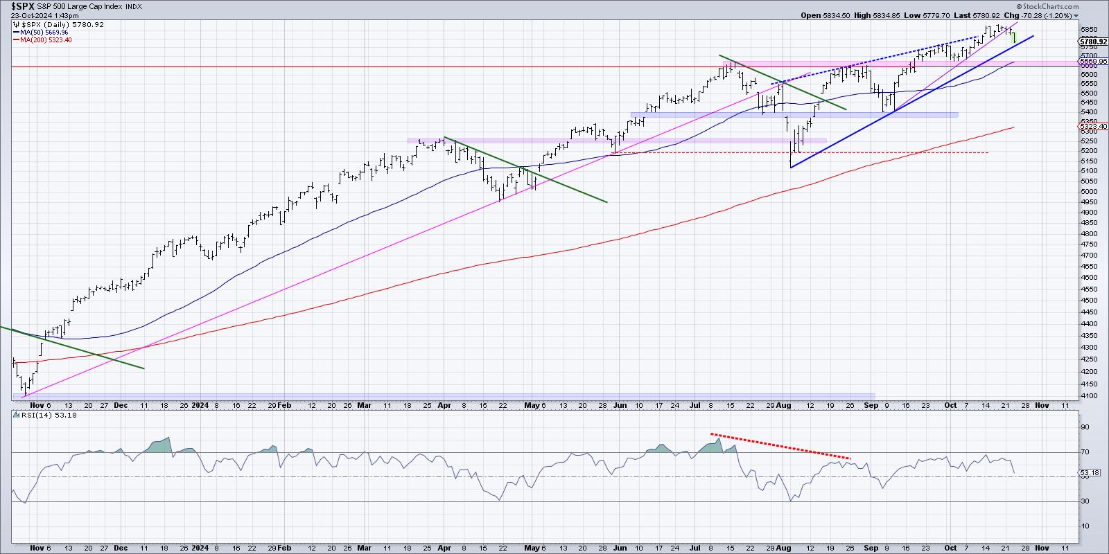


 In this video from StockCharts TV,